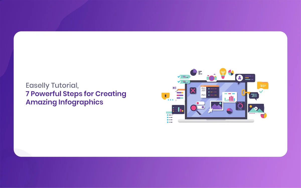
Welcome to The Morphic Studio ultimate guide on visual storytelling. Easelly, we live in a world where everyone has a very short attention span. If you throw a massive wall of text at your website visitors, they will probably close the tab immediately. That is exactly where visual data comes in to save the day. You do not need to be a professional graphic designer with years of expensive school training to make beautiful graphics. Thanks to modern web tools, anyone can turn dry numbers into a beautiful visual story. This step by step guide will teach you exactly how to master the art of visual design without losing your mind.
If you have been searching The Morphic Studio for a simple way to share data, you are in the right place. We are going to break down the entire process from start to finish. You will learn how to plan your ideas, pick colors, and share your final work with the world. Designing can feel very intimidating when you look at a blank white screen, but it becomes incredibly fun when you have a clear map to follow. Let us dive in and see how easy it can be to change your regular text content into something memorable.
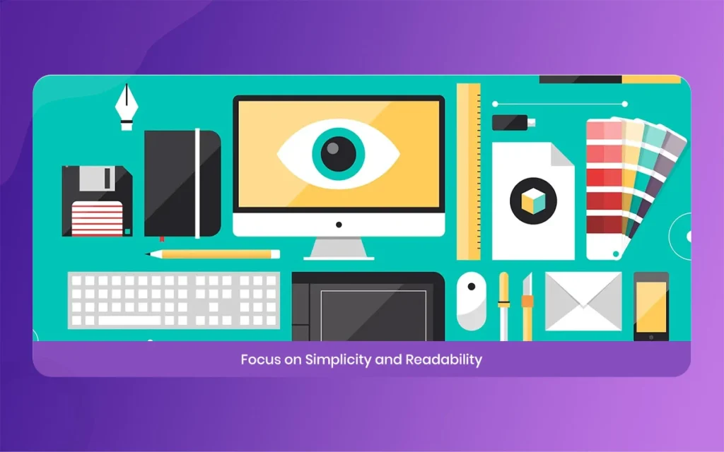
What is the Easelly Infographic Platform?
Before we start building, we should talk about what this tool actually is. The Easelly platform is a web-based design application built specifically for creating infographics, posters, and educational charts. Unlike complex software that takes months to learn, this tool uses a very friendly drag and drop interface. It was created for teachers, students, business owners, and bloggers who need to make an impact quickly. You can access thousands of pre-made templates, icons, and shapes directly from your internet browser without downloading a single heavy file to your computer.
The tool has gained massive popularity over the years because it removes the technical barriers to creation. In fact, it even won awards from educational associations for its simple interface. It is highly valued because it focuses purely on infographic layouts instead of trying to be a general photo editor. Whether you need to explain a complex medical process, show a history timeline, or present a monthly sales report to your boss, this tool gives you the exact canvas you need. It makes the design process look like child’s play, even for absolute beginners.
Easelly
Follow the Free vs Pro Options in Easelly
When you first sign up for an account, you will have to choose between a free account and a premium paid plan. The free version of the Easelly interface gives you access to a basic selection of templates and design shapes. It is a fantastic playground if you just want to practice or if you only need to make a couple of simple charts for a school project. You can upload your own images and export your final work in standard quality, which is enough for basic web viewing.
Regardless of how, if you want to create truly professional business graphics, the pro plan offers a lot more power. The premium version unpicks millions of premium icons, high-definition charts, and unique fonts. Furthermore, the 2026 updates have introduced much better team sharing tools and advanced chart editing options. If you are working with a brand, the pro account lets you save your specific brand colors and logos for fast access. It is a very cheap investment considering how much money you would save on hiring an outside design agency.
Why Visual Design Matters on The Morphic Studio
When you publish content on your website, your main goal is to get people to understand and think of your message. Human brains process images thousands of times faster than plain text lines. By using the Easelly software to build your web graphics, you are giving your audience a visual anchor. This keeps people on your web page for a much longer time, which lowers your bounce rate and tells search engines that your website provides real value to real people.
Good graphics also get shared on social media far more often than regular articles. When a reader sees a beautiful, informative chart on your site, they are highly likely to pin it on Pinterest or share it on LinkedIn. This brings a steady stream of free organic traffic back to your domain. Investing a small amount of time into creating good visual content is one of the smartest things you can do for your statistical growth strategy.
Easelly
Brainstorm Your Core Topic and Audience for Easelly
Every great design begins long before you click any buttons on your screen. Before opening your Easelly dashboard, you must clearly define what you want to say. Think about the one single message you want your reader to take away after looking at your graphic. If you try to cram five different massive topics into one single layout, your design will become a messy disaster. Focus on a single question or a specific problem that your audience needs help solving right now.
Knowing your audience is just as critical as choosing your main topic. A graphic made for middle school students will look completely different from one made for corporate bank executives. Young students need bright colors, large cartoon icons, and very minimal text. On the other hand, executives want clean lines, professional charts, and deep data analysis. Write down your target reader’s needs on a piece of paper before you even think about picking out a template design.
Gather Reliable Data for Your Easelly Project
An infographic is only as good as the research behind it. When you are collecting data for your Easelly layout, always look for highly credible and authoritative sources. Government databases, university research papers, and well-known industry reports are the best places to start your search. Make sure your facts are as fresh as possible, especially if you are writing about fast-moving industries like technology or health care. Outdated facts will quickly ruin your personal brand credibility.
As you do your online research, copy the website links for your sources into a separate document. You will need to list these sources at the very bottom of your final graphic. This not only builds deep trust with your readers, but it also protects you from plagiarism issues. Try to look for surprising statistics or clear trends that tell a compelling story. Numbers can be quite beautiful when they reveal a hidden pattern that people never noticed before.
Easelly
Choose the Perfect Layout Structure in Easelly
Now it is time to open the online tool and look at the interface. The Easelly template library is organized by different categories to help you find the right fit quickly. Do not just pick a layout because you like the pretty colors, because you can change those colors later. Instead, look at the actual structure of the columns and lines. If you are comparing two different products, look for a split two-column layout. If you are explaining a step by step recipe, a vertical timeline style is the best choice.
Easelly
Analyzing the Common Types of Layouts in Easelly
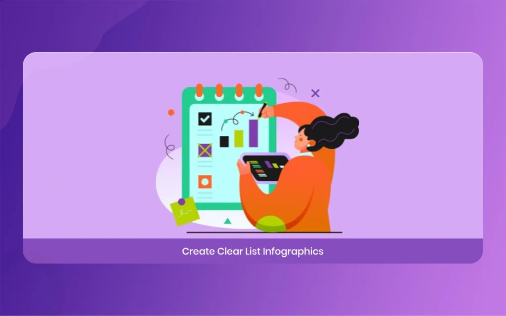
Informational Layouts, These use bold headers and clear numbered lists to explain a concept or summarize a blog post.
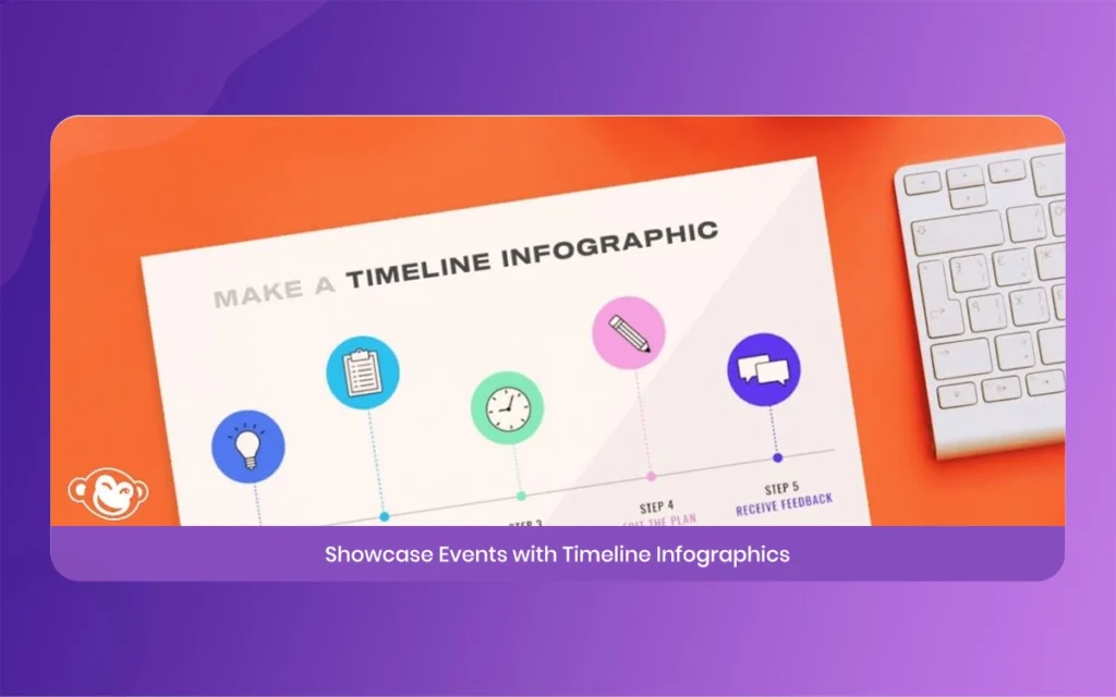
Timeline Layouts, Excellent for showing historical events, project deadlines, or the step by step growth of a business over time.
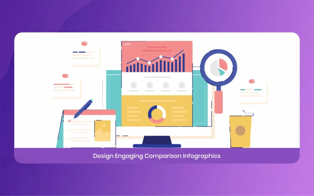
Comparison Layouts, Designed with a clear middle split to compare two opposite things, showing the pros and cons of each choice clearly.
Statistical Layouts, Built to highlight massive data points, pie charts, and percentages using huge fonts that immediately grab the eye.
Process Layouts, Uses clear directional arrows to guide a reader through a complex workflow or a manufacturing system from start to finish.
Geographic Layouts, Features maps and regional icons to show demographic trends or location-based research facts.
Hierarchical Layouts, Uses pyramid shapes or organizational flowcharts to show levels of importance, like a company structure or food groups.
If you are feeling creative, you can always choose a completely blank template and start from scratch. Regardless of how, using a pre-made template saves an enormous amount of time. The professional designers at the company have already done the hard work of balancing the spaces and margins. Starting with a solid template ensures that your final project looks balanced and professional, which prevents your elements from looking cluttered or messy.
Easelly
Customize Your Text and Fonts with Easelly Editor
Once your template is open on your screen, you can click on any text box to change the words. When writing for an infographic within the Easelly editor, less is always more. Cut out all unnecessary words and edit your sentences until they are short and punchy. Use big, bold headers to split up the different sections of your design. Your text should simply provide context for the graphics, not replace them. If a paragraph looks too long, try turning it into a short bulleted list instead.
Best Font Practices for the Easelly Creator
Limit Your Fonts, Never use more than two or three different font styles in a single design file to keep things looking clean.
Create Clear Hierarchy, Make your main title massive, keep your subheadings medium, and make your body text small but highly readable.
Prioritize Text Readability, Avoid fancy cursive fonts for your main information because they are very difficult to read on small mobile screens.
Match Font Personalities, Use strong block fonts for serious business topics and softer rounded fonts for casual or creative projects.
Keep an eye on the spacing between your lines of text. If your words are packed too closely together, your readers will strain their eyes and scroll away. Give your text plenty of breathing room, which designers call white space. This negative space gives the eyes a place to rest and actually makes the important text parts stand out much more.
Easelly
Add Energetic Objects and Charts in Easelly
This is where the real magic happens. The Easelly objects library contains a massive collection of icons, shapes, and illustrations that you can drag directly onto your canvas. Instead of writing out the word “growth”, you can drop in an icon of a green growing plant or an upward arrow. Icons help readers understand your point instantly without reading a single word. Make sure all your icons share a similar visual style, so do not mix realistic photos with simple flat cartoon drawings.
Managing Visual Elements Inside the Easelly Interface
Energetic Charts, The 2026 update lets you double-click charts to type in your custom percentages, and the chart will automatically reshape itself instantly.
Icon Consistency, Stick to either all outlined icons or all solid color icons throughout your document to maintain a unified look.
Object Opacity, Use the new opacity slider tool to make background shapes slightly see-through, which prevents them from distracting from text.
Color Matching, Use the color dropper tool to match the color of your newly added icons perfectly with the original template colors.
Be careful not to overdo it with your decorations. It is very easy to get excited and drop fifty different icons onto your canvas because they look cool. Every single object you add must serve a real purpose and support your data. If an icon is just sitting there looking pretty without adding any real meaning to the topic, delete it. A clean design with ten perfect icons is always better than a messy page with forty random drawings.
Easelly
Master Color Theory for a Cohesive Easelly Style
Colors trigger deep emotional reactions in our minds before we even process the words on a page. When designing your Easelly masterpiece, you should pick a strict color palette of three or four colors max. Use one dominant color for your background, a secondary color for your main shapes, and a bright accent color for your most important numbers or buttons. If you are talking about environmental issues, soft greens and blues work perfectly. If you are talking about fire safety, bold oranges and reds will command attention.
The secret to a professional look is high contrast. If you use a dark blue background, your text must be bright white or bright yellow so it pops out. Writing dark grey text on a black background is a massive mistake that makes your content impossible to read. The recent platform upgrades include beautiful pre-made color swatches that look great together. If you are stuck, simply use one of their expert color combinations to ensure your infographic looks cohesive and polished.
Easelly
Download and Promote Your Finished Easelly Masterpiece
Congratulations, your beautiful visual graphic is finally finished. Before you share it, take a moment to do a final proofread check. Look for typos, misrange icons, or broken chart numbers. It is always a smart idea to ask a friend to look at it for two minutes. If they cannot understand the main point of your graphic quickly, you might need to simplify your layout a bit more. Once everything looks perfect, click the export button at the top of the interface.
Final Thoughts
The Easelly download tool gives you several file options depending on your needs. For standard website blog posts, a high-quality PNG file is usually the absolute best choice because it keeps the lines crisp while keeping the file size relatively small. If you plan to print your graphic onto a large physical poster for a presentation, download the high-resolution PDF format instead. Now that you have your file, embed it into your website articles, share it across your social channels, and watch your user engagement numbers grow.
Related Article
July 21, 2026
Best Way To Create Cinematic lighting in Unreal Engine 5 by Morphic Studio [Tutorial]
The Magic of Cinematic lighting in Unreal Engine 5 Have you ever looked at a beautifully rendered game or a virtual film set and wondered how they make it look so incredibly real? Well, the answer almost always comes down to the lighting. Today, we are going to take a look at the magic of […]
July 20, 2026
How To Add Lighting Realistic Rainy Weather in Unreal Engine 5 [Tutorial]
Lighting a stormy environment in Unreal Engine 5 is one of the most rewarding challenges for any 3D environment or lighting artist. Many beginners think that adding rain is as simple as spawning a splash particle system and turning down the sun, but the real secret lies in how light interacts with moisture, clouds, and […]
July 18, 2026
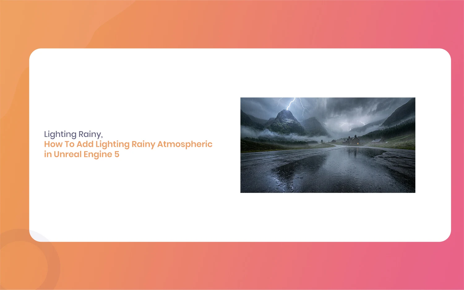
How To Add Lighting Rainy Atmospheric in Unreal Engine 5 [Tutorial]
Hello everyone, and welcome to this new guide. If you are a game developer or a 3D artist, you probably know how important weather is. Creating a moody scene can completely change how a player feels. Today, we are going to look at something very specific. We are going to learn how to add Lighting […]