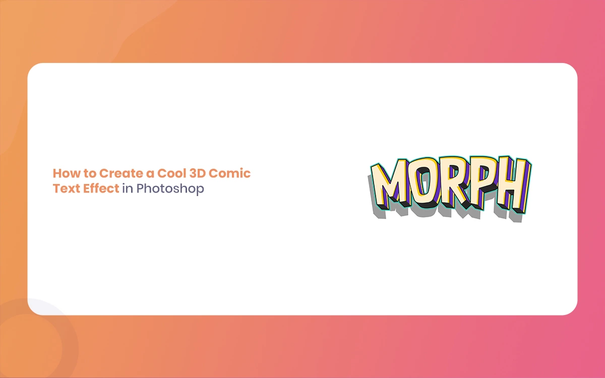
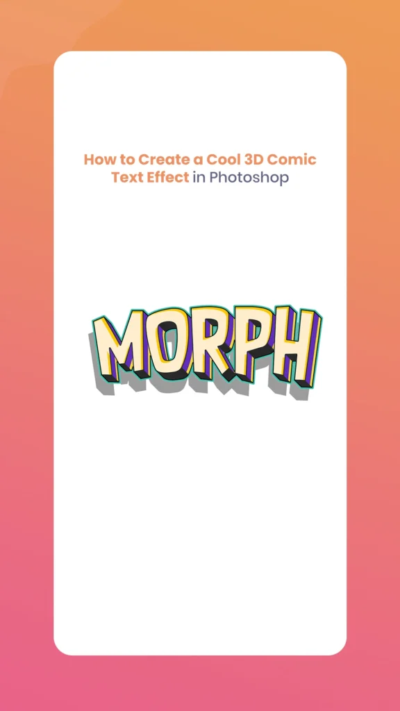
Creating eye-catching Cool 3D Comic Text Effect in Photoshop is one of the most rewarding design skills you can master. Whether you’re designing promotional materials, social media graphics, or adding that perfect finishing touch to a creative project, comic-style typography brings instant energy and visual appeal to your work. The Morphic Studio share the process, from initial setup to final polish, to ensure you can create professional-quality results.
The beauty of Cool 3D Comic Text Effect lies in its versatility and visual impact. By combining strategic layer management, carefully crafted layer styles, and energetic colour schemes, you can transform ordinary text into energetic, attention-grabbing graphics that pop off the screen. This technique draws inspiration from classic comic book typography while leveraging modern statistical tools to achieve effects that would have been impossible with traditional methods.
Follow the Comic Text Attractive
Before diving into the technical aspects, it’s essential to understand what makes comic text so distinctive and appealing. Comic book typography has developed progress over decades, developing specific visual conventions that signal action, emotion, and drama. The basic elements include bold, chunky letterforms, high-contrast colour schemes, pronounced 3D effects, and often exaggerated proportions.
The 3D effect in comic text serves multiple purposes further on than just visual appeal. It creates hierarchy, draws the eye, suggests movement and energy, and adds depth to what would otherwise be flat typography. When executed properly, these effects can make text appear to leap off the page, creating an immediate emotional connection with viewers.
Essential Tools and Preparation
Setting Up Your Workspace
Creating effective 3D comic text requires a well-organized workspace and the right tools at your disposal. Begin by making certain your Photoshop workspace is optimized for this type of work. Consider customizing your panels to have easy access to the Layers, Character, and Blending Options panels, as these will be your primary tools throughout the process.
Your choice of canvas size significantly impacts the final quality of your work. While the guide suggests a minimum of 2,000×2,000px, consider your intended use case. For print materials, you might need even larger dimensions, while web graphics can often work with smaller sizes. The basic is maintaining enough resolution to preserve sharp edges and smooth gradients in your final output.
Step-by-Step Implementation Guide
1. Document Setup and Background Creation
Start by creating a new document in Photoshop with dimensions appropriate for your project. A square canvas of 2,000×2,000px provides excellent flexibility for most applications. When setting up your document, choose RGB color mode for statistical applications or CMYK for print projects.
The background plays a crucial supporting role in comic text design. Rather than settling for a plain color, create a radial gradient that complements your text colors. Classic comic combinations like bright yellow transitioning to orange, or electric blue fading to purple, immediately establish the energetic mood you’re aiming for. Apply the gradient from the center outward to create natural vignetting that helps focus attention on your text.
2. Typography Selection and Configuration
Font choice can make or break your comic text effect. While the guide mentions specific fonts like “Komika Axis,” “Luckiest Guy,” and “BD Cartoon Shout,” the basic characteristics to look for include bold mass, condensed or expanded proportions, and distinctive character shapes that maintain readability at large sizes.
When inputting your text, use all capital letters to maintain the traditional comic book attractive. Increase the font size substantially – comic text should command attention and fill a significant portion of your canvas. Adjust character spacing (tracking) to ensure letters have enough breathing room while maintaining visual cohesion.
3. Adding Energetic Movement with Warping
Static text lacks the energy that defines great comic typography. Photoshop’s Warp transformation feature allows you to introduce organic curves and movement that suggest action and excitement. The Arc warp is particularly effective, creating a subtle bow that makes text appear to surge forward.
Experiment with different warp options – Flag, Wave, and Fish warps can create interesting effects depending on your text and intended mood. The basic is subtlety; too much warping can make text difficult to read and appear amateurish.
4. Building the 3D Structure
The 3D effect forms the foundation of compelling comic text. This process involves creating multiple duplicates of your text layer, each positioned slightly offset from the previous one. Start by duplicating your main text layer and shifting it down and to the right by 3-5 pixels.
Change the color of this duplicate to create visual separation – deep purples, blues, or blacks work well as they recede visually, enhancing the 3D illusion. Continue this process, creating 5-8 duplicate layers, each shifted progressively further. This technique, sometimes called “extrusion,” creates the appearance of dimensional depth.
For efficiency, consider creating a Photoshop Action to automate the duplication and positioning process. This becomes particularly valuable when working on multiple text elements or refining your effect.
5. Layer Styles: The Magic Touch
Layer styles transform your stacked text layers into professional-looking comic typography. Start with your topmost text layer and access the Blending Options dialog. The stroke effect is fundamental – apply an inner white stroke of 6-10px width to create that classic comic outline.
Add a second stroke on the outside, typically black and thicker than the inner stroke, to enhance readability and add that authentic comic book border. The drop shadow should be substantial but not overwhelming – use black color, Linear Burn blend mode, 50% opacity, and position it at approximately 120° angle with significant distance and size values.
Gradient overlays breathe life into your text by adding color variation and visual interest. Use bright, saturated colors arranged at angles that complement your text’s warping and general composition.
6. Advanced Texturing and Details
Professional comic text often incorporates subtle texture elements that reference traditional printing techniques. Halftone patterns, reminiscent of vintage comic book printing, can be applied to background elements or even directly to text layers using blend modes like Luminosity or Overlay.
Create these patterns using Photoshop’s built-in filters or download high-quality halftone brushes. Apply them sparingly on separate layers, allowing you to fine-tune their opacity and blend modes for optimal integration.
Color Theory and Comic Attractives
Follow Comic Color Palettes
Comic book color schemes tend toward high saturation and strong contrast. Primary and secondary colors dominate, often pushed to extremes that would appear garish in other contexts but perfectly suit the energetic comic attractive. Follow color connections helps you make choices that enhance rather than compete with your text.
Complementary color schemes (colors opposite each other on the color wheel) create maximum visual impact and are frequently used in comic design. In whatever way, analogous schemes (neighboring colors) can create more harmonious, sophisticated effects while maintaining the comic feel.
Implementing Effective Color Strategies
When applying colors to your 3D comic text, consider the viewing hierarchy. The foreground text should use the most energetic, attention-grabbing colors, while the extruded layers gradually become more subdued. This creates natural depth perception and guides the viewer’s eye to the most important elements.
Background colors should support rather than compete with your text. If your text uses warm colors, consider cooler backgrounds, and vice versa. This contrast ensures your text remains the focal point while creating visual harmony.
Technical Optimization and Best Practices
Layer Management Strategies
Organizing your layers properly from the beginning saves significant time and frustration later. Group related layers together – all your 3D extrusion layers in one group, layer styles in another. Use descriptive naming conventions that make it easy to identify specific elements even when working on complex compositions.
Consider using Smart Objects for your text elements. This allows you to edit the original text content while preserving all applied effects, making revisions much more manageable.
Performance Considerations
3D comic text effects can quickly become resource-intensive, for the most part when working with multiple text elements or high-resolution documents. Monitor your system performance and consider flattening or rasterizing layers that no longer need editing to maintain smooth workflow.
Working with linked Smart Objects allows you to create a master template that can be quickly adapted for different text content while maintaining consistent styling.
Common Pitfalls and Solutions
Challenge
Cause
Solution
Muddy, unclear text
Over-saturation or insufficient contrast
Increase contrast between text and background; simplify color palette
Flat appearance despite 3D layers
Insufficient offset or poor color choices for extrusion
Increase layer offset distance; use darker, more recessive colors for depth layers
Illegible text at small sizes
Overly complex effects or thin strokes
Simplify effects; increase stroke masss; test at intended viewing size
Inconsistent lighting
Multiple conflicting drop shadow angles
Standardize shadow direction across all elements; maintain consistent light source
Poor edge quality
Low resolution or excessive effects
Work at higher resolution; simplify overly complex layer styles
Time-consuming workflow
Manual repetition of effects
Create Actions for repetitive tasks; use Smart Objects for templating
Advanced Techniques and Variations
Creating Energetic Compositions
Once you’ve mastered the basic 3D comic text effect, take a look at compositional techniques that enhance the general impact. Consider the principle of visual mass – larger, brighter, more detailed elements draw more attention. Use this to create hierarchy within your design.
Experiment with overlapping text elements, varying scales, and rotation to create more energetic compositions. The goal is controlled chaos that maintains readability while maximizing visual excitement.
Integration with Other Design Elements
Comic text rarely exists in isolation. Consider how your typography interacts with other graphic elements like speech bubbles, action lines, burst effects, and character illustrations. These elements should complement your text rather than compete with it.
Star bursts, radial lines, and geometric shapes can enhance the energetic feeling of your comic text while providing compositional balance and visual interest.
Workflow Optimization and Templates
Creating Reusable Templates
Developing a library of text effect templates significantly accelerates your design process. Create master files with your preferred layer styles, color schemes, and basic structures that can be quickly adapted for new projects.
Document your settings and create style sheets that capture successful color combinations, layer style parameters, and compositional approaches. This reference material becomes adjective when working under tight deadlines or maintaining consistency across multiple projects.
Automation and Actions
Photoshop Actions can automate much of the repetitive work involved in creating 3D comic text. Record actions for layer duplication and positioning, application of basic layer styles, and other routine tasks. While initial setup requires some time investment, the long-term efficiency gains are substantial.
Consider creating action sets for different styles of comic text – subtle effects for elegant applications, extreme effects for high-impact designs, and everything in between.
Applications and Use Cases
The versatility of 3D comic text makes it valuable across numerous design applications. Social media graphics benefit from the attention-grabbing nature of comic typography, while event posters and promotional materials can grip its energetic qualities to convey excitement and urgency.
Web design applications require consideration of how effects will render across different devices and browsers. While complex layer styles work beautifully in static images, simplified versions may be necessary for web-optimized graphics.
Gaming interfaces and mobile app designs often incorporate comic-style typography to create engaging, playful user experiences. The bold, high-contrast nature of comic text makes it particularly effective for gaming applications where quick readability is essential.
Cool 3D Comic Text Effect By The Morphic Studio
Quality Control and Final Polish
Before considering your 3D comic text complete, conduct thorough quality checks at different sizes and in various contexts. Text that looks perfect at full resolution may become muddy or illegible when scaled down for social media use.
Test your designs against different background colors and in both light and dark interface contexts if they’ll be used in statistical applications. This ensures your text maintains its impact and readability across all intended use cases.
Pay particular attention to edge quality – zoom in to check for rough or pixelated edges that might detract from the professional appearance of your work. Clean, crisp edges are hallmarks of quality statistical typography.
Finally
Creating a compelling Cool 3D Comic Text Effect in Photoshop combines technical proficiency with artistic vision. The techniques defined in this guide provide a solid foundation, but the real magic happens when you begin experimenting and developing your stylistic approaches.
The basic to mastering this technique lies in following the underlying principles rather than simply following the steps. Comic typography is about energy, movement, and emotional impact. Every technical choice – from colour selection to layer positioning – should serve these larger goals.
Think of that great comic text design that balances complexity with clarity. While it’s tempting to apply every available effect, restraint and purposeful decision-making often produce more powerful results. Focus on creating hierarchy, maintaining readability, and supporting your general design message.
As you develop your skills, build a personal library of successful techniques, colour combinations, and compositional approaches. This resource becomes increasingly valuable as you tackle more complex projects and work under tighter deadlines.
The investment in mastering Cool 3D Comic Text Effect pays dividends across many areas of graphic design. These skills translate well to other display typography challenges and provide a foundation for following how visual effects can enhance communication and emotional impact.
Whether you’re creating social media content, promotional materials, or exploring personal creative projects, the ability to craft engaging, professional-quality comic text effects opens up new possibilities for visual communication. The techniques are accessible to designers at any skill level, but the potential for creative expression and professional application is virtually limitless.
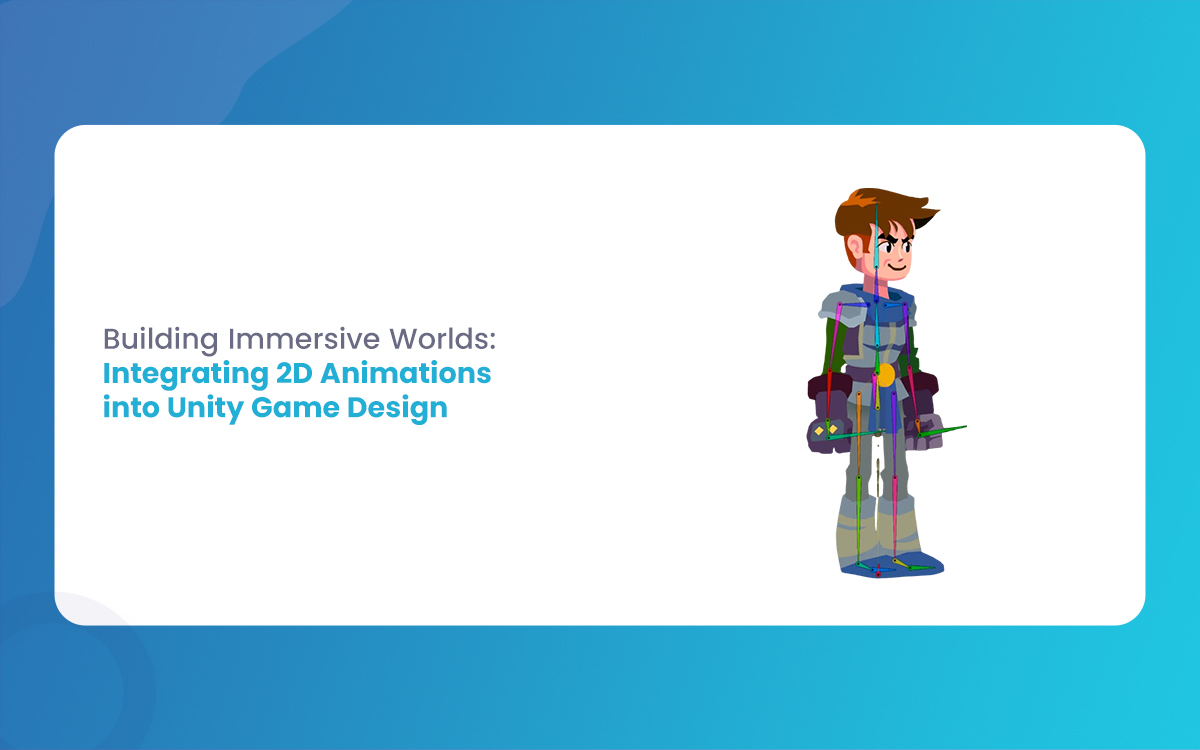
Building Immersive Worlds: Integrating 2D Animations into Unity Game Design
In the modern gaming environment, the distinction between “2D” and “3D” has blurred into a spectrum of stylistic choices rather than a hierarchy of quality. While 3D graphics often chase the horizon of photorealism, 2D animation remains the heart of expressive, artistic, and tactile game design. From the hand-drawn elegance of Cuphead to the pixel-perfect […]
March 6, 2026
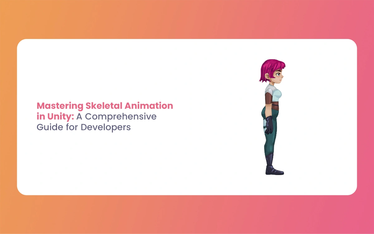
Mastering Skeletal Animation in Unity: A Complete Guide for Developers
Imagine breathing life into a lifeless 3D model, watching it stride confidently across your game world or execute a flawless combat combo. That’s the magic of Skeletal Animation in Unity, a powerhouse system that powers everything from indie platformers to AAA blockbusters. At its heart, skeletal animation grips rigs and Unity’s Mecanim framework to deform […]
March 5, 2026
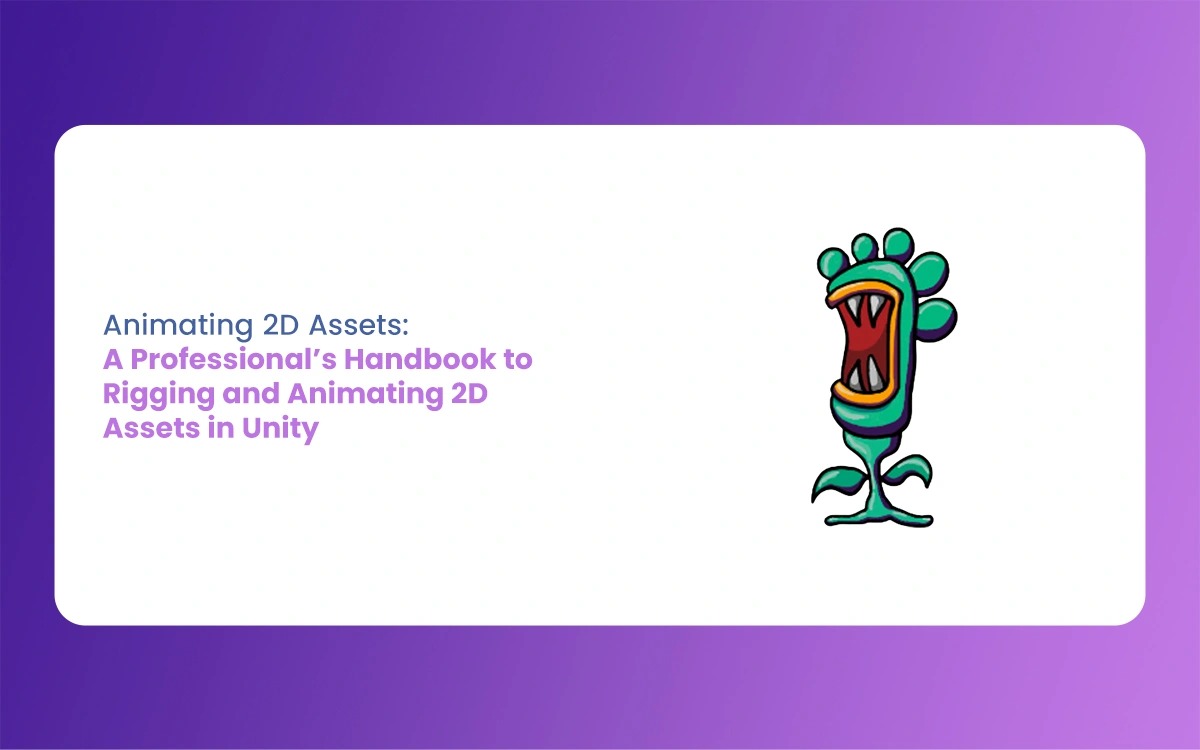
A Professional’s Handbook to Rigging and Animating 2D Assets in Unity
Game development is always changing, and the difference between 2D and 3D workflows is becoming less clear. If you have experience with 3D tools like Blender, Maya, or 3ds Max, Unity’s Animating 2D Assets package can help you make the switch to 2D more easily. Rather than using frame-by-frame sprite swapping, many developers now use […]