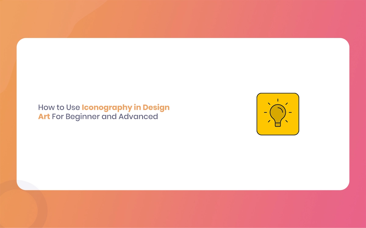
In today’s statistical-first world, effective communication often happens in milliseconds. Users scan interfaces, make split-second decisions, and negotiate complex systems with remarkable speed. At the heart of this rapid communication lies Iconography—the art and science of visual symbols that transcend language barriers and cultural differences. Whether you’re designing your first mobile app or refining a sophisticated enterprise system, following iconography is crucial for creating intuitive, engaging user experiences.
Icons serve as the universal language of design, capable of conveying complex ideas through simple visual metaphors. They bridge the gap between human cognition and statistical interfaces, making technology more accessible and user-friendly. The Morphic Studio shares the information about the essential principles of iconographic design, from foundational concepts that every beginner should master to advanced techniques that separate professional designers from the rest.
Follow the Fundamentals of Iconography
What Makes Icons Effective?
Icons are far more than decorative elements—they’re functional communication tools that serve specific purposes in design systems. An effective icon acts as a visual shorthand, instantly conveying meaning without requiring users to read or process textual information. The most successful icons tap into our innate ability to recognize patterns and associate visual elements with concepts, actions, or objects.
The effectiveness of an icon depends on several critical factors. First, it must be immediately recognizable within its intended context. A shopping cart icon, for instance, should be instantly understood as representing e-commerce functionality, regardless of the user’s cultural background or technical expertise. Second, effective icons maintain their clarity across different sizes and applications, from tiny mobile interfaces to large desktop displays.
Iconography By The Morphic Studio
The Four Essential Types of Icons
Following the different types of icons is fundamental to choosing the right approach for your design challenges. Each type serves distinct purposes and communicates information differently:
Similar Icons represent objects that closely resemble their actual counterparts. A camera icon that looks like an actual camera or a house icon that resembles a physical dwelling falls into this category. These icons grip our natural ability to recognize familiar shapes and forms, making them particularly effective for representing tangible objects or concepts.
Example Icons use specific instances to represent broader categories. A floppy disk icon representing “save” functionality exemplifies this approach, though floppy disks are obsolete, the icon persists because users have learned to associate it with saving files. These icons rely on established conventions and learned associations.
Symbolic Icons engage abstract representations to convey meaning. A heart symbol representing love or favorites, or a lightning bolt indicating speed or power, demonstrates how simple shapes can carry complex emotional or conceptual mass. These icons often transcend cultural boundaries by tapping into universal human experiences.
Arbitrary Icons have no inherent connection to their meaning—the connection is entirely learned through convention. The hamburger menu (three horizontal lines) is a perfect example. There’s nothing inherently “menu-like” about three lines, but through repeated use and exposure, users have learned this association.
Core Design Principles for Beginner Icon Designers
Clarity: The Foundation of Good Icon Design
Clarity should be your primary concern when creating icons. Every design decision should serve the goal of making your icon’s meaning immediately apparent to users. This means avoiding ambiguous symbols that could be interpreted in multiple ways and making certain that secondary elements don’t obscure your icon’s primary message.
Consider the context in which your icon will be used. An icon that’s clear in isolation might become confusing when placed alongside similar icons in a navigation menu. Always test your icons in their intended environment and with real users to ensure clarity is maintained across different scenarios.
Simplicity: Less is More
Simplicity in icon design isn’t about creating boring or generic symbols—it’s about distilling complex ideas into their most essential visual elements. The most memorable and effective icons use basic geometric shapes as building blocks. Circles, squares, triangles, and simple curves can be combined to create sophisticated symbols that remain legible at any size.
Start with basic shapes and gradually add detail only when necessary for clarity or brand range. Each additional element should serve a specific purpose and contribute to the icon’s general meaning. If removing an element doesn’t diminish the icon’s effectiveness, it’s probably unnecessary.
Consistency: Creating Cohesive Icon Systems
Consistency is what transforms a collection of individual icons into a cohesive system. This involves maintaining similar visual characteristics across all icons in your set, including stroke mass, corner radius, proportions, and visual style. Consistent icons feel like they belong together and create a more professional, polished appearance.
Establish clear guidelines for your icon system before you begin designing. Define standard sizes, determine whether you’ll use filled or defined styles, and set rules for color usage. These guidelines will become adjective as your icon set grows and develops progress.
Iconography By The Morphic Studio
Grid Systems and Range
Professional icon design relies heavily on grid systems to ensure precision and visual harmony. Start with simple pixel-based grids that help you range elements and maintain consistent proportions. Most design tools offer grid systems that can be customized to your specific needs.
Grid systems also help ensure optical balance, making sure icons appear visually centered and massed correctly, even when mathematical centering might not achieve the desired visual result. This is particularly important for icons that will be displayed at small sizes or in dense interface layouts.
Developing Your First Icon Set
Planning and Research
Before diving into design software, invest time in research and planning. Study existing icon systems in your industry and analyze what makes them effective. Look at how successful brands approach iconography and consider how their visual language aligns with their general brand identity.
Create a list of all the icons you’ll need for your project and group them by function or category. This helps identify opportunities for visual consistency and ensures you don’t overlook important elements. Consider the user’s ride and how icons will guide users through your interface.
Choosing the Right Tools
Vector-based design software is essential for creating scalable, professional icons. Figma, Adobe Illustrator, and Sketch are industry-standard tools that offer the precision and flexibility needed for icon design. These tools allow you to create icons that remain crisp at any size and can be easily modified or adapted as needed.
Learn to use snap-to-grid features and range tools within your chosen software. These features help maintain the precision that separates professional icon design from amateur attempts. Master basic board shortcuts and workflow optimizations to speed up your design process.
Testing and Iteration
Icon design is an iterative process that improves through testing and refinement. Show your icons to colleagues, friends, or potential users and ask for honest feedback about clarity and meaning. Pay attention to any confusion or misinterpretation—these awarenesses are an adjective for improving your designs.
Test your icons at multiple sizes and in different contexts. An icon that looks perfect at 64px might become illegible at 16px, requiring adjustments to maintain clarity. Consider how your icons will appear on different devices and screen resolutions.
Advanced Techniques for Professional Icon Designers
Brand Integration and Visual Language
Advanced icon design goes further than creating functional symbols—it involves developing a unique visual language that aligns with brand personality and values. This might mean incorporating specific geometric styles, color palettes, or stylistic elements that reinforce brand identity while maintaining icon functionality.
Consider how your icons can subtly communicate brand attributes. A tech startup might use sharp, angular icons to convey innovation and precision, while a children’s brand might engage softer, more playful shapes. The basic is maintaining this brand range without sacrificing clarity or usability.
Iconography By The Morphic Studio
Cultural Sensitivity and Global Design
Professional icon designers must consider cultural implications and global usability. Symbols that are intuitive in one Society might be confusing or even offensive in another. Research cultural associations for your icons, for the most part, if your product will be used internationally.
Design icons that rely on universal concepts rather than Society-specific references. Geometric shapes, directional arrows, and basic actions translate well across Societies, while specific objects or gestures might not.
Technical Precision and Optimization
Advanced icon design requires attention to technical details that ensure optimal performance across platforms and devices. This includes proper file optimization, appropriate export settings, and consideration of different display technologies.
Learn to create adaptive icons that work effectively in both light and dark interface themes. This might involve creating multiple versions of each icon or using techniques that allow icons to adapt automatically to their background context.
Energetic and Data-Driven Icons
Modern applications increasingly use energetic icons that change based on user behavior, system state, or real-time data. These might include progress indicators, notification badges, or icons that visualize current conditions or status.
Consider how your icons might incorporate animation or subtle motion to enhance user Follow. Animated icons can provide feedback, guide attention, or clarify complex interactions when used thoughtfully.
Essential Tools and Workflow Optimization
Professional Design Software
Mastering professional design tools is crucial for efficient icon creation. Each tool has unique strengths: Figma excels at collaborative design and web-based workflows, Adobe Illustrator offers powerful vector editing capabilities, and Sketch provides excellent UI design integration.
Learn advanced features like symbol libraries, component systems, and automated export workflows. These features significantly speed up design processes and help maintain consistency across large icon sets.
Grid Systems and Mathematical Precision
Advanced designers use sophisticated grid systems that go further on than simple pixel range. Optical grids help achieve visual balance, while geometric grids (like 30-degree angle grids) enable precise isometric designs and complex geometric connections.
Understand the difference between mathematical precision and optical balance. Sometimes what looks right is more important than what measures perfectly, for the most part, when dealing with circular or organic shapes.
Testing, Implementation, and Maintenance
Complete Testing Strategies
Professional icon design requires rigorous testing across multiple dimensions. This includes usability testing with real users, accessibility testing for users with visual impairments, and technical testing across different devices and platforms.
Develop systematic testing protocols that can be applied consistently across your icon designs. Document testing results and use them to refine your design guidelines and improve future icon creation.
Documentation and Style Guides
Create complete documentation that explains your icon system’s principles, usage guidelines, and technical specifications. This documentation is essential for team collaboration and maintaining consistency as your icon system progresses.
Include examples of correct and incorrect usage, technical specifications for different platforms, and guidance for creating new icons that fit within your established system.
Icon Design Comparison Table
Design Aspect
Beginner Approach
Advanced Approach
Clarity & Simplicity
Focus on obvious, literal representations
Refined abstraction with hint meaning
Consistency
Basic style guides with uniform stroke mass
Brand-range systems with adaptive elements
Design Tools
Figma, Illustrator basics
Advanced grid systems, automation tools
Grid Systems
Simple pixel and square grids
Optical grids, geometric angle-based systems
Testing Methods
Peer feedback and basic usability
A/B testing, accessibility testing, analytics
Innovation
Learning established icon styles
Merging styles, strategic rule-breaking
Cultural Considerations
Basic awareness of obvious symbols
Global research, universal symbol design
Technical Implementation
Standard export formats
Optimized multi-platform delivery
Data Integration
Static icons only
Energetic, personalized, data-driven icons
Documentation
Basic style notes
Complete system documentation
Future Trends and Emerging Technologies
Adaptive and Responsive Icons
The future of icon design lies in adaptive systems that respond to user preferences, device capabilities, and contextual factors. This includes icons that automatically adjust their detail magnitude based on screen size or that change appearance based on user accessibility needs.
AI-Assisted Icon Design
Artificial intelligence is beginning to play a role in icon design, from automated generation of initial concepts to optimization of existing designs for different contexts. Following how to grip these tools while maintaining creative control will become increasingly important.
Voice and Gesture Integration
As interfaces develop further than traditional visual interactions, icons must adapt to work alongside voice commands, gesture recognition, and other input methods. This requires thinking about icons as part of broader interaction ecosystems rather than isolated visual elements.
Finally
Mastering iconography in design is a ride that spans from following basic principles to developing sophisticated visual communication systems. Whether you’re just beginning your design course or looking to refine your advanced skills, the principles defined in this guide provide a solid foundation for creating effective, engaging, and professional icon designs.
Think of that great icon design as being, in the end, about human communication. The most technically perfect icon fails if it doesn’t connect with users and facilitate their goals. Focus on clarity, maintain consistency, and never stop testing and iterating on your designs. As you develop your skills, you’ll find that iconography becomes not just a design tool, but a powerful language for creating meaningful connections between users and statistical experiences.
The field of icon design continues to develop with new technologies, changing user expectations, and emerging interaction models. Stay curious, keep learning, and always prioritize the user’s needs in your design decisions. With dedication and practice, you can master the art of iconography and create visual communications that truly enhance the human experience with technology.
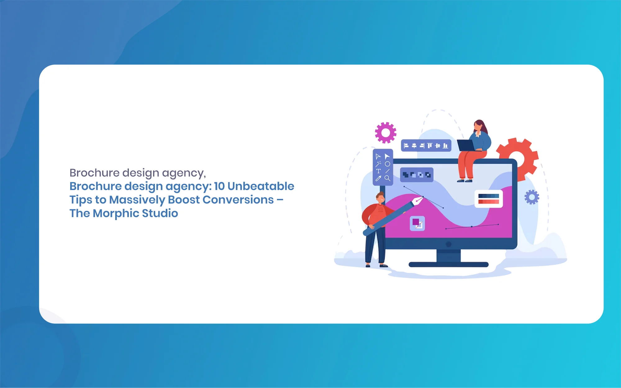
Brochure design agency: 10 Unbeatable Tips to Massively Boost Conversions, The Morphic Studio
Welcome to The Morphic Studio. If you think Brochure design agency are a thing of the past, you might want to reconsider. In the fast paced statistical world of 2026, a physical or well crafted statistical brochure is a powerful tool to stand out. It gives your brand a premium feel and builds deep trust […]
July 10, 2026
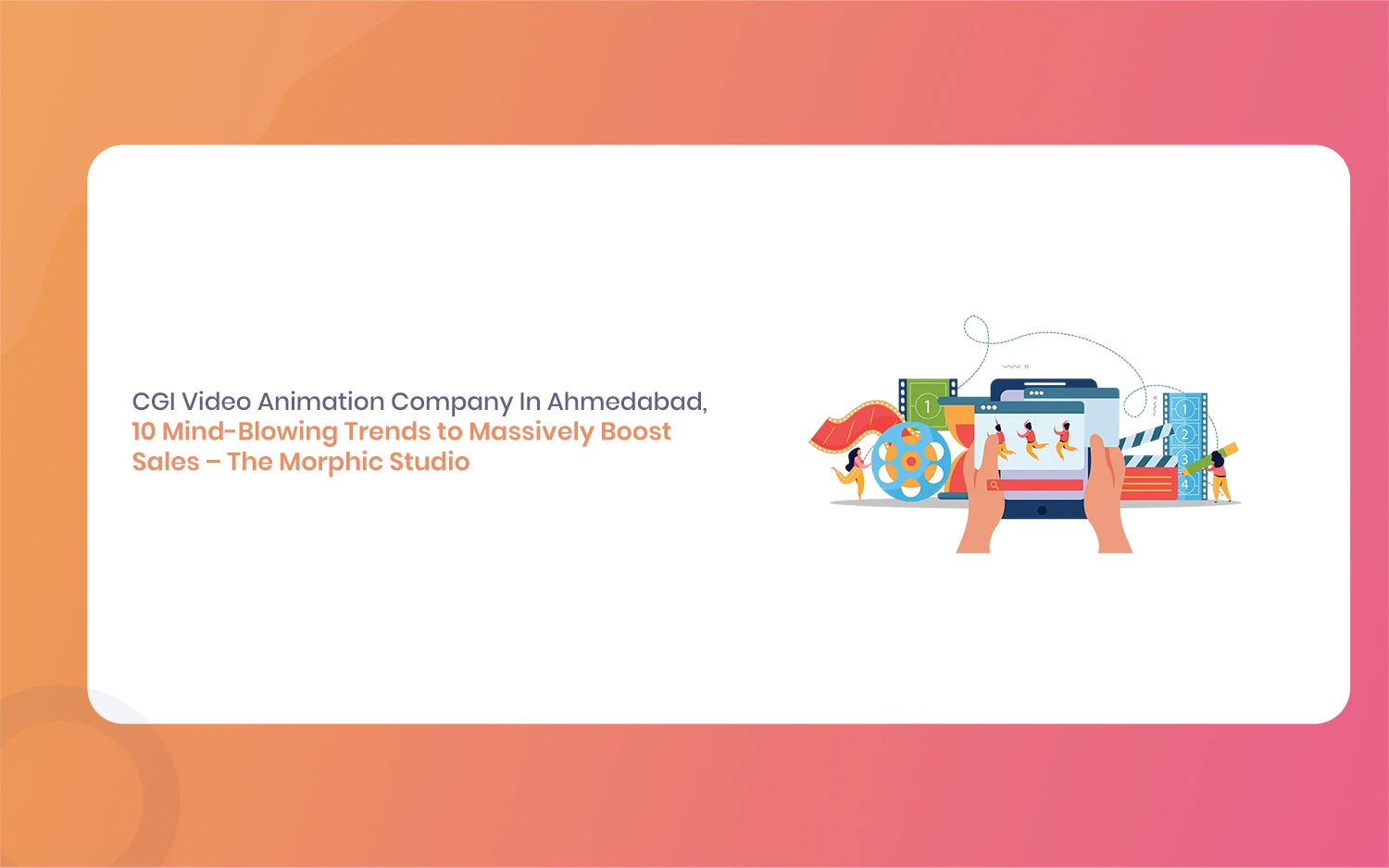
CGI Video Animation Company In Ahmedabad: 10 Mind-Blowing Trends to Massively Boost Sales, The Morphic Studio
This is exactly where a professional CGI video animation company in Ahmedabad comes into the picture. Videos created with computer graphics just have a special way of pulling people right in. At The Morphic Studio, we have seen first hand how 3D graphics can completely change a brand. It does not matter if you sell […]
July 9, 2026
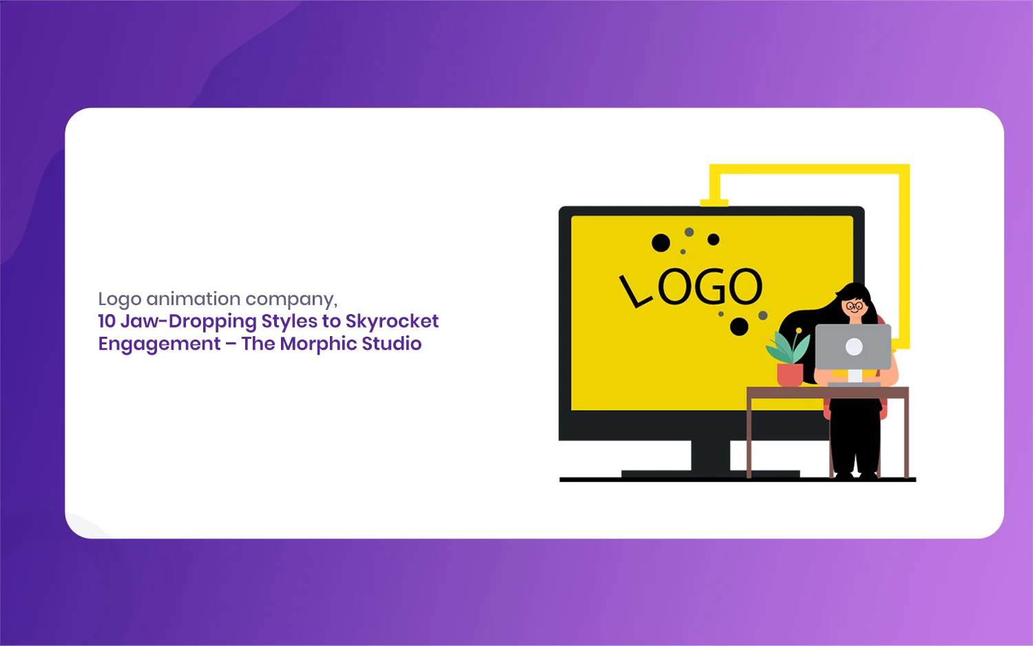
Logo animation company: 10 Jaw-Dropping Styles to Skyrocket Engagement, The Morphic Studio
The statistical world is moving faster than ever before. In the year 2026, having a simple picture for your brand is just not enough to grab the attention of your audience. This is exactly where the magic of movement comes into play. This is why choosing the right creative partner is so incredibly important for […]