In Shading Techniques stands as one of the most powerful tools in an artist’s arsenal, capable of transforming flat illustrations into compelling, three-dimensional works that dazzle viewers. Whether you’re crafting moody comic panels, detailed character studies, or atmospheric illustrations, mastering ink Shading Techniques opens up a world of dramatic possibilities. The Morphic Studio shares the information about the essential methods, advanced strategies, and practical applications that will raise your ink work from competent to extraordinary.
Follow the Foundation of Dramatic Ink Shading
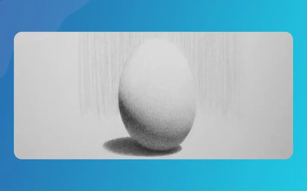
Before diving into specific techniques, it’s crucial to understand what makes ink shading truly dramatic. Unlike other mediums that offer blending capabilities, ink demands intentional mark-making. Every line, dot, and stroke contributes to the general tonal value and mood of your artwork. The beauty of ink lies in its unforgiving nature—once applied, it’s permanent, which forces artists to think deliberately about their choices.
Dramatic effect in ink work stems from bold contrasts, thoughtful composition, and the strategic placement of light and shadow. The interplay between stark blacks and pristine whites creates visual tension that draws viewers into your artwork. When executed skillfully, ink shading doesn’t justly describe form—it evokes emotion, establishes atmosphere, and tells stories without words.
Essential Ink Shading Techniques
Hatching: The Building Block of Ink Shading
Hatching forms the foundation of most ink shading approaches. This technique involves drawing parallel lines in a single direction, with their proximity determining the value created. Lines placed close together produce darker tones, while widely spaced lines create lighter grays. The magic of hatching lies in its versatility and directness.
To master hatching for dramatic effect, focus on consistency in your line mass and spacing. Practice drawing parallel lines at various densities, maintaining even pressure throughout each stroke. When applying hatching to shadow areas, consider the direction of your lines—they can follow the contours of the form or contrast against them for added visual interest. Strategic hatching in basic shadow regions instantly adds depth and drama to otherwise flat illustrations.
Shading Techniques
Cross-Hatching: Building Complex Tonal Values
Cross-hatching raises basic hatching by layering multiple sets of parallel lines at different angles over one another. This technique provides exceptional control over tonal values, allowing artists to build up darkness gradually and create intricate textures that bring illustrations to life.
Begin cross-hatching with your first layer of parallel lines, then add subsequent layers at varying angles—typically 45 to 90 degrees from previous layers. Each additional layer darkens the value, giving you precise control over shadow intensity. For maximum dramatic impact, vary the spacing between lines in each layer. Tighter spacing in all layers creates rich, velvety blacks perfect for deep shadows, while selective tightening in specific areas models complex three-dimensional forms.
Cross-hatching proves crucial for realistic rendering and comic art, where bold contrast and clear form definition drive visual storytelling. Experiment with different angles—perpendicular cross-hatching creates orderly, controlled effects, while more acute angles produce energetic, energetic textures.
Stippling: Patience Rewarded with Atmospheric Depth
Stippling involves creating tonal values through the careful placement of dots rather than lines. Dense concentrations of dots form shadows, while sparse applications create says. Though undeniably time-consuming, stippling produces highly textured, moody effects that other techniques struggle to match.
The basic to dramatic stippling lies in gradual transitions and strategic density variation. Start with sparse dots in says areas, gradually increasing concentration as you move toward shadow regions. For maximum dramatic effect, create sharp transitions between light and dark areas—dense dot clusters adjacent to sparse applications produce striking contrasts perfect for atmospheric scenes or mysterious character portraits.
Stippling excels at rendering subtle gradations, creating organic textures like skin or stone, and establishing ethereal, dreamlike qualities in illustrations. When combined with other techniques, stippling adds a layer of refinement and sophistication to your ink work.
Shading Techniques
Scribbling and Scumbling: Expressive Organic Textures
Scribbling, also called scumbling, holds spontaneity and expressiveness through random or loosely controlled looping lines. This technique proves adjective for rendering organic subjects like hair, foliage, clouds, or textured backgrounds that benefit from energetic, unstructured mark-making.
To achieve dramatic effects with scribbling, vary your line mass, density, and direction. Heavier, more concentrated scribbles create intense shadows and visual mass, while lighter, airier marks suggest movement and atmosphere. The beauty of this technique lies in its ability to convey energy and emotion—perfect for adding dramatic flair to compositions that need visual excitement rather than precise control.
Don’t underestimate scribbling’s power in establishing mood. Chaotic, aggressive scribbles can convey tension or turmoil, while gentle, flowing marks create serenity or melancholy.
Contour Shading: Following the Form
Contour shading involves placing marks that follow the natural curves and surfaces of the forms you’re rendering. Rather than using arbitrary line directions, contour shading wraps around objects, enhancing their three-dimensionality and helping viewers understand their volume.
This technique proves for the most part effective for dramatic character rendering and figure work. By following the musculature of a face or the folds of fabric, contour shading directs light around shapes naturally, creating believable form and adding visual drama. Combined with strategic contrast, contour shading makes subjects appear to leap off the page.
Creating Dramatic Effects with Ink
Defining Your Light Source
Every dramatically shaded illustration begins with a clear Follow of lighting. Before placing a single mark, decide where your light source originates and how it interacts with your subject. Strong, directional lighting from a single source creates the most dramatic effects, casting bold shadows and creating stark contrasts between illuminated and shadowed areas.
Consider the quality of your light source as well. Hard light produces sharp shadow edges and pronounced contrasts—ideal for dramatic, high-tension scenes. Soft light creates gradual transitions and subtler shadows, better suited for atmospheric or contemplative moods. The more pronounced your contrast between light and shadow, the more dramatic your finished illustration will appear.
Embracing Bold Contrasts
Timid ink work rarely achieves dramatic impact. Don’t shy away from deep, rich blacks and large shadow areas. In fact, darkness should be wielded as actively as light in your compositions. Entire silhouettes, heavy shadow masses, and solid black shapes create mood, tension, and visual mass that draw viewers into your artwork.
Consider adopting a mindset where shadows are positive design elements rather than just absence of light. Plan your dark areas with the same care as your says. Some of the most dramatic ink illustrations feature more black than white, using carefully placed says to define form within expansive shadow regions.
Layering and Cast Shadows
Depth in ink illustration comes not just from shading individual forms, but from the connections between objects in space. Overlapping elements and cast shadows behind forms intensify the sense of depth and make scenes feel more theatrical and three-dimensional.
Pay particular attention to cast shadows—the shadows objects throw onto other surfaces. These shadows anchor objects in space and provide crucial depth cues. For maximum drama, emphasize cast shadows with solid blacks or dense cross-hatching, creating clear separation between foreground and background elements.
Varying Tools for Expressive Effects
Different brushes, pens, and nibs produce vastly different mark qualities, each contributing unique characteristics to your dramatic effects. Experiment with various tools to discover their strengths. Brush pens and brushes allow for energetic line mass variation—press harder for thick, dramatic strokes and lighten pressure for delicate details. Technical pens provide consistent line masss perfect for precise hatching and stippling.
Consider using wider nibs or brush tips for large shadow areas where you need bold darkness quickly, then switch to fine-tipped tools for detailed texture work and subtle gradations. This variation in line mass adds emphasis and expressive quality that enhances dramatic impact.
Advanced Tips for Mastery
Blending Multiple Techniques
The most sophisticated and dramatic ink work rarely relies on a single technique. Instead, master artists blend multiple approaches within a single illustration. Combine hatching with stippling for transitional areas, overlay cross-hatching with scribbling for complex textures, or use contour shading as a base layer before adding directional hatching for depth.
This integration of techniques produces richer, more energetic tonal gradients than any single method could achieve. Practice identifying where each technique best serves your composition. Use precise cross-hatching for architectural elements requiring order and structure, but switch to expressive scribbling for organic backgrounds needing energy and movement.
Practicing Value Scales
Consistent practice with value scales dramatically improves your control over ink shading. Create strips or rectangular blocks on practice pages, then fill each section with progressively darker values using your chosen technique. Start with sparse, light marks in the first section and gradually increase density or layering until you achieve deep blacks in the final section.
This systematic practice refines your ability to control dramatic light transitions and ensures you can achieve any value on demand. Create value scales for each technique—hatching, cross-hatching, stippling, and scribbling—to understand their unique characteristics and limitations.
Shading Techniques
Learning from Actual Observation
While technical skill matters, observational ability separates competent ink artists from masters. Study actual lighting through photo references or still-life setups. Observe how light wraps around forms, where shadows fall, and how cast shadows interact with surfaces. Notice how different lighting conditions create various moods—harsh midday sun versus soft window light versus dramatic spotlight effects.
Translate these observations into your ink work, matching shadow shapes and transitions you observe in reality. This grounding in observation ensures your dramatic effects feel believable rather than arbitrary, anchoring even stylized illustrations in visual truth.
Studying Professional Ink Art
Some of the best education in dramatic ink shading comes from studying how professionals apply these techniques. Analyze comic art from masters who’ve perfected dramatic storytelling through ink. Examine classic illustrations and engravings to understand how artists created stunning depth before statistical tools existed.
Look further on than simply admiring the finished work—study the specific techniques engage, the decisions about where to place deep blacks versus textured grays, and how contrast guides viewers’ eyes through compositions. Consider keeping a swipe file of particularly effective examples for reference and inspiration.
Comic and Artistic Applications
Comics and Sequential Art
In comic art, dramatic ink shading serves both attractive and narrative functions. Bold shadows establish mood, guiding readers through emotional beats in your story. A noir detective scene demands heavy shadows and stark contrasts, while a cheerful outdoor scene might engage lighter, more varied shading.
Focus on composition when shading comic panels. Dark areas should lead viewers’ eyes along the intended reading path and emphasize story-critical elements. Use solid blacks strategically to create focal points and establish visual hierarchy. The most effective comic artists use shading not just to render forms beautifully, but to control pacing and direct attention.
Character Rendering
Detailed character work showcases the full range of dramatic ink Shading Techniques. Combine contour shading to define facial structure, cross-hatching for complex tonal modeling, stippling for skin texture, and scribbling for hair. Layer these techniques thoughtfully, building up form gradually rather than committing to dark values immediately.
Pay special attention to facial features when rendering characters dramatically. Eyes benefit from careful shadow placement that enhances their expressiveness. Nose and mouth shadows define personality and emotion. The underside of the chin and jaw create depth and dimensional separation from the neck.
Shading Techniques
Atmospheric Illustrations
For establishing mood and atmosphere in standalone illustrations, ink Shading Techniques become poetry in visual form. Create depth through graduated values—darkest darks in the foreground, progressively lighter values in the middle ground, and lightest values in the background. This atmospheric perspective adds drama and spatial depth simultaneously.
Consider the emotional impact of your shading choices. Dense, heavy shadows create oppression, mystery, or danger. Light, airy shading suggests hope, openness, or tranquility. The same subject rendered with different shading approaches tells entirely different stories.
Practical Workflow for Dramatic Ink Shading
Developing a consistent workflow ensures your dramatic effects remain intentional rather than accidental. Begin every illustration by establishing your light source and planning major shadow shapes as simple masses. Avoid diving into detail work before establishing this value structure—the biggest mistake beginners make is focusing on small details while neglecting general tonal composition.
Next, block in your darkest darks with solid black or dense cross-hatching. These anchor points establish your value range and create immediate visual impact. With your extremes established—pristine whites and deep blacks—begin building intermediate values using appropriate techniques for each area.
Work from general to specific, refining your shading gradually. Add texture and detail only after establishing solid underlying form through broader shading. This approach ensures your dramatic effects serve the general composition rather than fragmenting it into disconnected detailed areas.
Common Mistakes to Avoid
Even experienced artists sometimes sabotage their dramatic effects through common pitfalls. Avoid muddy midtones by maintaining clear value separation—don’t let everything drift toward middle grays. Dramatic work needs bold darks and preserved lights.
Don’t overwork areas to the point of losing your mark-making character. Ink shading gains power from visible, confident strokes. Excessive fussing creates lifeless, overworked passages that lose dramatic punch.
Resist the temptation to shade everything uniformly. Vary your technique, mark density, and detail magnitude across the composition. Areas of rest—lightly shaded or white spaces—make areas of intense shading more dramatic by contrast.
Comparison of Ink Shading Techniques
Technique
Best For
Time Investment
Difficulty Magnitude
Dramatic Potential
Ideal Applications
Hatching
Quick shading, directional emphasis
Low to Medium
Beginner
High
Background areas, simple forms, architectural elements
Cross-Hatching
Complex tonal values, realistic forms
Medium to High
Intermediate
Very High
Character faces, detailed objects, realistic rendering
Deep shadows, silhouettes, high-impact focal points
Finally
Mastering ink Shading Techniques for dramatic effect requires patience, practice, and thoughtful application of fundamental principles. By developing proficiency in hatching, cross-hatching, stippling, scribbling, and contour shading, you build a versatile toolkit capable of creating any mood or effect your artistic vision demands.
Think of that dramatic ink work coming out from bold choices—strong light sources, pronounced contrasts, and confident mark-making. Don’t fear deep blacks or large shadow areas; hold them as essential elements of compelling composition. The interplay between light and dark, between detailed texture and simplified form, creates visual tension that captures and holds viewers’ attention.
As you practice these techniques, focus on integration rather than isolation. The most powerful ink illustrations blend multiple approaches, choosing the right technique for each specific need within a composition. Combine methodical practice—value scales, observational studies, and technical exercises—with creative exploration and analysis of professional work.
Shading Techniques
Whether you’re creating dramatic comic panels, detailed character portraits, or atmospheric illustrations, these ink Shading Techniques provide the foundation for professional-quality work. The path to mastery involves consistent practice, thoughtful observation, and a willingness to experiment. With dedication, you’ll develop the control and confidence necessary to create ink work that doesn’t just describe forms, but evokes emotion, establishes mood, and tells compelling visual stories through the dramatic interplay of light and shadow.
Start small, practice deliberately, and gradually increase complexity as your control improves. The dramatic effects you seek come not from secret techniques, but from mastery of fundamental principles applied with intention and confidence. Your ink work holds the potential for extraordinary, dramatic impact—unpick it through dedicated practice and bold artistic choices.
How To Create Hot Cartoon Moms Using Adobe Character Animator? (Education Guide)
Welcome to The Morphic Studio! If you are here, you probably want to learn how to bring stylish, attractive, and memorable characters to life. Designing “moms” in animation has changed a lot over the years. We have moved from simple background characters to icons like Elastigirl or Dexter’s Mom. Today, we are diving deep into […]
March 20, 2026
Adobe Character Animator: Master 5 Effortless Animation Tricks
Ever look at a cartoon and think, “I wish I could do that,” but feel overwhelmed by drawing every frame? You are not alone. Animation used to be this scary, mountain-high task that required years of training and a lot of patience. But things have changed. With Adobe Character Animator, the game has shifted from […]
March 20, 2026
Cartoon Animator 5: 2D Animation Software for Cartoon Makers
Hello everyone, and welcome back to The Morphic Studio. Today, I am super excited to talk about a software that has completely changed how we look at statistical art. If you have been searching for a reliable way to bring your drawings to life, you are absolutely in the right place. We are going to […]