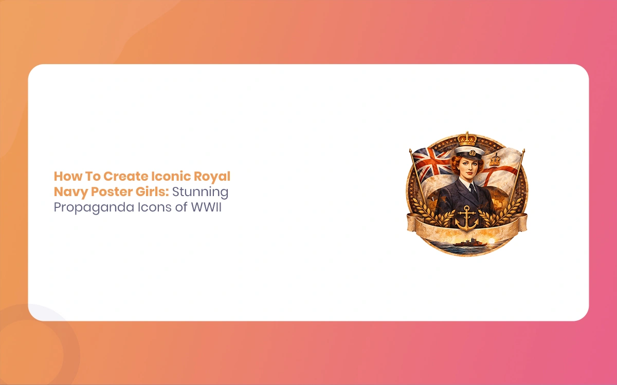
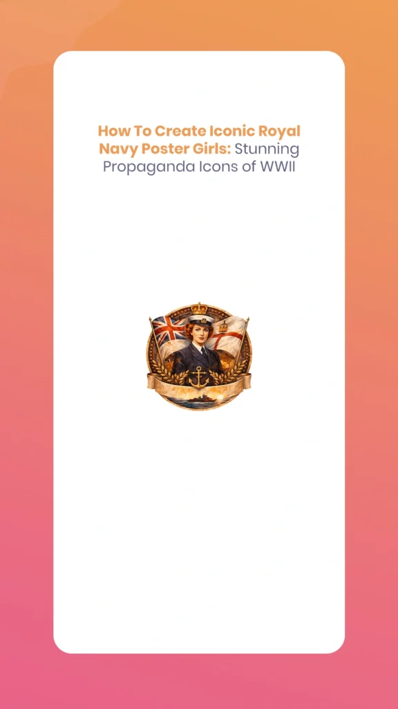
The striking imagery of World War II propaganda posters continues to dazzle audiences nearly eight decades later. Among the most memorable are the Royal Navy Poster Girls featuring glamorous Women’s Royal Naval Service (WRNS) members—affectionately known as “Wrens.” These bold, colorful designs combined patriotic fervor with sophisticated graphic design, creating propaganda icons that promised prospective recruits they could “free a man for the fleet” while serving their country with style and dignity.
Today’s statistical artists and designers can recreate these stunning vintage attractive using modern tools like Adobe Photoshop, Blender, and Cinema 4D. The Morphic Studio shares the information about the historical context, design principles, and step-by-step technical process for creating your own Royal Navy-inspired propaganda posters that blend historical authenticity with contemporary statistical artistry.
Follow the Historical Context
The Women’s Royal Naval Service in WWII
The WRNS was re-established in 1939 at the outbreak of World War II, building on its WWI legacy. By 1944, over 74,000 women served in the Wrens, performing essential roles including wireless telegraphy, radar plotting, weapons analysis, air mechanics, and administrative duties. The recruitment campaigns needed to attract educated, capable women while overcoming societal resistance to women in military service.
The Propaganda Strategy
British wartime propaganda develop progress sophisticated visual strategies to motivate recruitment and maintain morale. The Royal Navy posters specifically targeted young women from middle and upper-class backgrounds, depicting service as both glamorous and patriotic. Unlike the more utilitarian American “Rosie the Riveter” imagery, British WRNS posters emphasized femininity, sophistication, and the prestige of naval service—a calculated approach that proved remarkably effective.
Royal Navy Poster Girls
Deconstructing the Iconic Style Elements
The Glamorous Figure
The centerpiece of these posters was invariably a confident, attractive woman in the distinctive WRNS uniform. Basic visual characteristics included:
Uniform details: Navy blue jackets with gold buttons, white shirts, black ties, and the iconic tricorne hat with HMS ribbon
Confident posture: Energetic poses suggesting capability and determination—often looking upward or toward the horizon
Idealized beauty: Stylized features with strong jawlines, clear eyes, and composed expressions that conveyed both femininity and competence
Nautical context: Subtle background elements like ships, anchors, signal flags, or ocean waves that anchored the naval theme
Bold Typography and Messaging
The text treatment in WWII Royal Navy Poster Girls was as carefully crafted as the imagery:
Sans-serif dominance: Fonts like Gill Sans, Futura, or custom hand-lettered styles provided bold, readable impact
Slab serifs for emphasis: Chunky serifs added mass to basic words like “JOIN” or “NOW”
Hierarchical sizing: Primary messages occupied 30-40% of poster space, with secondary text significantly smaller
Rotated or stacked arrangements: Text following curves or diagonal paths created visual dynamism
Patriotic slogans: Concise calls-to-action like “Join the Wrens,” “Free a Man for the Fleet,” or “Serve to Save”
The Power of Color
WWII poster designers worked within the constraints of lithographic printing, which paradoxically created their distinctive attractive:
Limited palettes: Typically 3-5 colors to control printing costs
High contrast: Deep navy blues paired with bright reds, whites, and golds for maximum visual impact
Symbolic colors: Red, white, and blue evoked the Union Jack; gold suggested naval prestige and tradition
Aggressive accents: Crimson, teal, or orange provided urgency and emotional punch
Strategic color blocking: Large flat areas of solid color created modern, geometric compositions
Vintage Textures and Effects
The printing technology of the 1940s left distinctive marks that modern designers deliberately recreate:
Halftone patterns: Visible dot screens from the lithographic process
Registration imperfections: Slight color misrangement that add authenticity
Paper grain: Texture suggesting aged, weathered posters
Vignetting: Darkened or softened edges that draw focus to central subjects
Limited gradations: Flat colors with minimal smooth transitions
Royal Navy Poster Girls
Essential Tools and Resources
Software Requirements
Primary tool: Adobe Photoshop CS6 or later provides the complete toolset for poster creation, including layer management, selection tools, blend modes, and export options.
3D workflow additions: Blender (free, open-source) or Cinema 4D for creating custom 3D character models with period-accurate uniforms and poses. Rendering these models before compositing in Photoshop adds dimensional realism impossible with stock photography alone.
Typography tools: Adobe Illustrator or Affinity Designer for creating custom text treatments that can be imported as smart objects.
Visual Assets
Character sources: Commission or create 3D models of women in WRNS uniforms, or source royalty-free stock photography of models in nautical attire. Period costume rental companies often have authentic reproductions suitable for photography.
Font selections: Download period-appropriate typefaces:
Cheddar Gothic (bold condensed sans-serif)
Impact or Franklin Gothic (heavy, authoritative)
Futura Bold or Gill Sans Ultra Bold (geometric modernism)
Vintage slab serif fonts like Rockwell or Clarendon
Texture libraries: Free halftone patterns, paper textures, and vintage overlays available from resources like TextureKing, Brusheezy, or Creative Market.
Reference Materials
Study authentic WWII posters from Imperial War Museums archives, Library of Congress collections, or specialized books on wartime graphic design. Analyze composition, color connections, text placement, and figure proportions to internalize the attractive conventions.
Step-by-Step Creation Process
Step 1: Canvas Setup and Foundation
Begin with professional print specifications:
Create a new Photoshop document: 24 × 36 inches at 300 DPI resolution
Set color mode to CMYK (for print reproduction accuracy)
Add 0.125-inch bleed on all sides to ensure edge-to-edge printing
Create a background layer filled with navy base color (C=100, M=60, Y=20, K=30)
Lock this base layer to prevent accidental modifications
This large format mimics authentic propaganda poster dimensions while providing resolution suitable for modern high-quality printing.
Step 2: Subject Preparation
The central figure requires careful preparation:
Selection: Import your model photograph or 3D render. Use the Lasso Tool, Quick Selection, or Select and Mask to isolate the figure with precision
Refinement: In Select and Mask, adjust Edge Detection radius to 2-3 pixels, enable Smart Radius, and use the Refine Edge Brush on complex areas like hair
Print flattening effect: Apply Filter > Blur > Gaussian Blur at 0.6 pixels, then Filter > Sharpen > Smart Sharpen (Amount: 150%, Radius: 0.8) to mimic vintage printing’s soft-then-sharp quality
Color unification: Add a Hue/Saturation adjustment layer clipped to your figure, reducing saturation by 20-30% and shifting toward sepia or uniform blue tones
Contrast boost: Use Curves adjustment to deepen shadows and brighten says, creating the punchy contrast characteristic of lithographic prints
For 3D workflow users, render your Blender character with slightly exaggerated contrast and simplified shader materials before importing to Photoshop.
Royal Navy Poster Girls
Step 3: Compositional Graphics
Layer geometric elements that frame and support your central figure:
Figure placement: Position your WRNS model off-center (rule of thirds), rotated 15-30 degrees for energetic energy
Graphic shapes: Create rectangular selections filled with complementary colors:
Red and white striped rectangles suggesting signal flags
Rotated squares in gold for accent areas
Navy blue bands creating borders or frames
Circular accents: Use the Ellipse Tool to add circular badges, porthole shapes, or decorative medallions in contrasting colors
Nautical symbols: Import or create silhouettes of anchors, ships, waves, or naval insignia at reduced opacity (30-50%) as background texture
Arrange these elements on separate layers, maintaining clear visual hierarchy where the figure remains dominant.
Step 4: Typography Integration
Text transforms good imagery into effective propaganda:
Primary message: Select your boldest font (200-600 point size) and type your main slogan—”JOIN THE WRENS” works perfectly
Text placement: Position along the top third, potentially arched following a circular path (Type > Type on a Path)
Color coordination: Fill text with colors from your established palette—white with navy outline, or red with gold says
Kerning adjustment: Manually adjust letter spacing (Alt/Option + arrow basics) for tight, impactful spacing
Secondary text: Add supporting messages at smaller sizes (80-120 points) along the bottom—”Free a Man for the Fleet” or “Serve Your Country”
Text effects: Apply subtle drop shadows (Distance: 8px, Opacity: 60%) or outer glows for dimensional depth
Use Layer Styles conservatively—authenticity favors simpler treatments over excessive effects.
Step 5: Vintage Effects Layer
Now add the characteristic aged appearance:
Halftone overlay: Import a halftone texture or create one (Filter > Pixelate > Color Halftone), set blend mode to Screen at 50-65% opacity
Grain texture: Add paper or canvas texture set to Overlay or Soft Light blend mode at 30-40% opacity
Color variation: Create a new layer, fill with subtle gradient (navy to lighter blue), set to Divide blend mode at 15-25% opacity for printing irregularity
Spot color accents: Use Hue/Saturation adjustments on specific elements (like the WRNS hat ribbon) to punch up reds or gold with +20 saturation
Edge wear: Add subtle darkness around poster edges using a large soft brush on a new layer set to Multiply at 20-30% opacity
These layers should enhance vintage character without overwhelming the clarity of your message.
Royal Navy Poster Girls
Step 6: Final Refinement and Export
Polish your propaganda masterpiece:
Vignette creation: Add a Magnitudes adjustment layer, pull the mid-tone slider left slightly to darken, then mask the center to lighten your focal point
General contrast: Final Curves adjustment to ensure deep blacks and bright says
Color verification: View in CMYK Preview mode to check for out-of-gamut colors that won’t print accurately
Export options:
For print: Save as PDF/X-1a with bleed marks and color bars
For statistical: Export PNG (24-bit) or maximum quality JPG at full resolution
For web: Create a 72 DPI version scaled to 1200 pixels on longest side
Modern Adaptations and Creative Twists
3D Rendering Enhancement
For artists skilled in 3D modeling, creating custom characters offers unprecedented control:
Model period-accurate WRNS uniforms with realistic fabric draping
Render with dramatic lighting that mimics studio photography of the 1940s
Apply glossy shaders to buttons, hat brims, and insignia for eye-catching says
Export high-resolution renders that maintain crisp edges and clean selections
Create multiple poses or expressions for poster series consistency
Animation and Motion Graphics
Extend static posters into animated content:
Create subtle parallax effects where foreground and background elements shift independently
Animate text appearing letter-by-letter with vintage typewriter attractive
Export as GIF for social media or MP4 for video platforms
Add period-appropriate music or naval sounds for multimedia presentations
Contemporary Color Treatments
While respecting historical palettes, modern tools enable enhancement:
Layer gradient overlays that add dimensional vibrancy impossible in 1940s lithography
Use selective color grading to make reds more crimson or blues more electric
Experiment with duotone or tritone treatments for artistic variation
Create complementary versions with inverted palettes for visual interest
Conceptual Reinterpretation
Apply the propaganda attractive to contemporary messages:
Environmental recruitment (“Join the Ocean Conservation Corps”)
Career recruitment for modern navies with updated uniforms
Empowerment messaging celebrating women in STEM or leadership
Retro-themed commercial advertising with vintage appeal
Technical Comparison Table
Original WWII Trait
Modern Statistical Twist for Stunning Effect
Hand-illustrated WRNS uniform model
3D-rendered character with energetic pose, PBR materials, and glossy shaders for buttons and insignia
Simple block lettering slogan
Layered text with outer glow, drop shadow, and gradient fills for dimensional depth
Flat lithographic print process
Halftone overlays with adjustable blend modes; add subtle parallax in animation/GIF export
Limited 3-5 color palette
Gradient overlays and selective color grading for enhanced vibrancy while maintaining period feel
Static poster medium
Animated versions with text reveals, floating elements, and sound for social media engagement
Manual registration marks
Statistical precision with pixel-perfect rangement; intentional misregistration for authentic vintage effect
Fixed paper sizes
Scalable vector elements allowing reproduction from business cards to billboards
Single propaganda purpose
Adaptable template system for series consistency across multiple messages or campaigns
Finally
Creating stunning Royal Navy Poster Girls in the iconic WWII propaganda style represents a perfect fusion of historical appreciation and modern statistical artistry. By following the strategic design choices of 1940s graphic designers—their bold typography, limited color palettes, glamorous figure representation, and lithographic textures—contemporary artists can recreate and reimagine these powerful visual statements.
The technical process, while detailed, becomes intuitive with practice: foundation canvas setup, careful subject preparation, strategic compositional graphics, impactful typography, vintage texture layering, and professional export. Whether working entirely in Photoshop with stock imagery or incorporating 3D-rendered characters from Blender, the principles remain consistent—create bold, simple, emotionally resonant imagery that commands attention and communicates instantly.
Royal Navy Poster Girls
These propaganda posters succeeded not through complexity but through clarity, confidence, and visual impact. Modern recreations honor that legacy while leveraging statistical tools that would astound their original creators. The result transcends mere nostalgia; it becomes a bridge between historical graphic design excellence and contemporary creative possibility.
As you develop your own WRNS-inspired propaganda posters, think of how authenticity comes from Follow purpose, not just mimicking appearance. These posters recruited thousands of women for essential wartime service by presenting it as prestigious, exciting, and vital. Your modern adaptations can carry similarly powerful messages—whether celebrating historical contributions, promoting contemporary causes, or simply demonstrating mastery of a distinctive, attractive, and enduring style.
The glamorous Wrens of wartime posters remain iconic precisely because their creators understood visual persuasion at its finest. Now, armed with infinitely more powerful tools, you can create propaganda icons that are not only historically evocative but genuinely stunning in their technical execution and artistic impact.
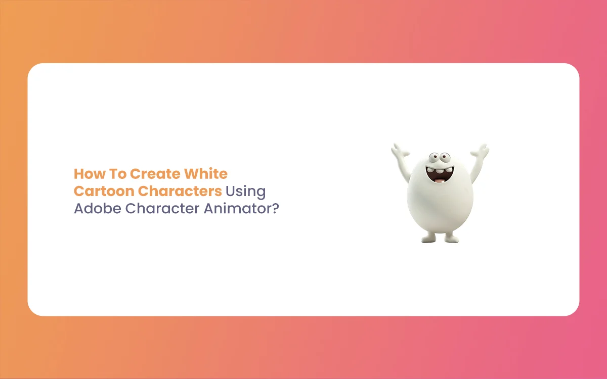
How To Create White Cartoon Characters Using Adobe Character Animator? (Education Guide)
If you have ever wanted to bring your drawings to life, you are in the right place. Animation used to be a very slow process where you had to draw every single frame by hand. However, things have changed. With the 2026 update of Adobe Character Animator, creating White Cartoon Characters is now faster and […]
March 31, 2026
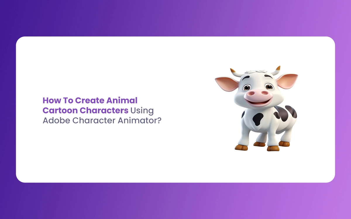
How To Create Animal Cartoon Characters Using Adobe Character Animator? (Education Guide)
Welcome to The Morphic Studio, your favorite corner of the internet for all things design and animation. If you have ever wanted to make a lion talk or a little rabbit dance, you are in the right place. Creating Animal Cartoon Characters used to take months of frame-by-frame work, but thanks to modern tech, it […]
March 30, 2026
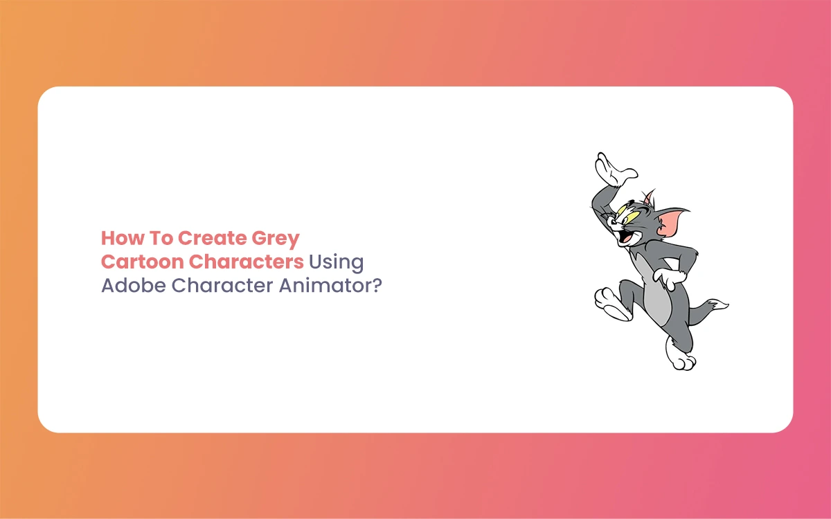
How To Create Grey Cartoon Characters Using Adobe Character Animator? (Education Guide)
Hello fellow creators, today I’ll show you how to bring your own Grey Cartoon Characters to life. Icons like Bugs Bunny prove that grey is perfect for animation—it’s neutral and supports highlights and shadows. With Adobe Character Animator’s 2026 update, animating these characters is easier than ever. Improved AI-driven motion tracking lets your puppet follow […]