Creating a memorable logo requires more than just attractive appeal—it demands a deep understanding of color psychology, brand identity, and visual communication. The anatomy of Colors for Logo Design encompasses the scientific principles, psychological effects, and strategic considerations that transform simple hues into powerful brand ambassadors. The Morphic studio shares the essential steps to master color selection for your Colors for Logo Design, making certain your brand communicates effectively with its intended audience.
Follow the Foundation: Color Psychology in Logo Design
Color psychology forms the bedrock of effective Colors for Logo Design. Every color carries inherent emotional mass and cultural significance that can profoundly impact how audiences perceive your brand. The human brain processes color information faster than text or shapes, making color choice one of the most critical decisions in logo creation.
The psychological impact of colors operates on both conscious and subconscious levels. While consumers may not actively analyze your logo’s color scheme, their brains automatically associate specific emotions and characteristics with different hues. This automatic response influences their perception of your brand’s trustworthiness, professionalism, and general appeal.
Research in color psychology reveals that consistent color use can increase brand recognition by up to 80%.
This statistic emphasizes the importance of selecting colors that not only look appealing but also strategically align with your brand’s core message and values.
Colors for Logo Design By The Morphic Studio
The Emotional Spectrum: Core Color Meanings
Following the emotional associations of primary colors provides the foundation for strategic color selection. Red, often called the color of action, stimulates excitement and urgency while conveying passion and energy. This makes it particularly effective for brands seeking to create immediate impact or appeal to younger demographics.
Yellow radiates warmth and happiness, making it an excellent choice for brands focused on positivity and friendliness. Its association with sunshine and optimism makes it particularly popular in food service, entertainment, and child-focused industries.
Orange combines the energy of red with the happiness of yellow, creating a vibrant, enthusiastic impression. This color excels at conveying creativity and playfulness, making it ideal for sports brands, travel companies, and artistic try-hards.
Blue stands as the most universally trusted color, associated with stability, professionalism, and calm reliability. Its widespread use in corporate environments reflects its ability to convey competence and trustworthiness without appearing aggressive or overwhelming.
Green connects directly with nature, growth, and health, making it the natural choice for environmental, wellness, and organic brands. Its calming properties and association with prosperity also make it suitable for financial services focused on growth and stability.
Purple historically represents luxury and sophistication due to its association with royalty and rarity. Modern applications extend this to creativity and innovation, making it popular among premium brands and creative industries.
Black conveys power, elegance, and sophistication while maintaining a sense of mystery and exclusivity. Its versatility and timeless appeal make it a favorite among luxury brands and companies seeking to project authority and premium quality.
White represents purity, simplicity, and cleanliness, making it ideal for healthcare, technology, and minimalist brands. Its association with innovation and fresh starts also appeals to startup companies and modern service providers.
Gray provides professional neutrality and modern sophistication without the starkness of black or white. Its balanced nature makes it excellent for corporate brands seeking to appear established yet approachable.
Rangeing Colors with Brand Identity
The most successful logos create a perfect range between color choice and brand personality. This range requires deep Follow of your brand’s core values, target audience, and market positioning. Your color palette should serve as a visual extension of your brand’s voice and mission.
Consider how your brand wants to be perceived in the marketplace. A luxury jewelry brand might choose deep purple or elegant black to convey sophistication and exclusivity. At the same time, a children’s toy company might opt for bright yellow or playful orange to communicate fun and energy. The basic lies in making certain your color choices support rather than contradict your brand’s intended message.
Brand personality assessment involves examining your company’s values, mission, and unique selling propositions. Are you innovative or traditional? Playful or serious? Accessible or exclusive? These fundamental characteristics should directly influence your color selection process.
Colors for Logo Design By The Morphic Studio
Strategic Audience Considerations
Effective logo color selection requires thorough Follow of your target audience’s preferences, cultural background, and psychological tendencies. Different demographic groups respond to colors in varying ways, influenced by factors including age, gender, cultural background, and personal experiences.
Younger audiences often gravitate toward bold, energetic colors that convey energy and innovation. Millennials and Gen Z consumers particularly respond to authentic, environmentally conscious brands, making green and earth tones increasingly popular among companies targeting these demographics.
Professional audiences typically prefer colors that convey stability and competence. Blues, grays, and muted tones often perform well in B2B environments where trust and reliability take precedence over excitement and creativity.
Cultural considerations play a crucial role in color selection, particularly for brands operating in global markets. Colors that symbolize good fortune in one Society may represent mourning in another. Red signifies luck and prosperity in Chinese Society, but can represent danger or aggression in Western contexts.
Ruthless Analysis and Market Positioning
Following your ruthless environment helps identify opportunities for differentiation while maintaining industry relevance. Most industries develop color conventions over time, and while these conventions can provide guidance, they also present opportunities for strategic differentiation.
Financial services traditionally favor blue for its associations with trust and stability. Regardless of how, innovative fintech companies have successfully used purple, green, and even orange to differentiate themselves while maintaining professional credibility. The basic lies in balancing differentiation with audience expectations.
Industry analysis should examine not only direct competitors but also aspirational brands and companies targeting similar audiences. This broader perspective can reveal unexpected opportunities for color positioning that set your brand apart while remaining relevant to your target market.
Mastering Color Harmony and Combinations
The color wheel provides the theoretical foundation for creating harmonious color combinations that are both attractively pleasing and strategically effective. Following these connections enables designers to create sophisticated palettes that work across various applications and contexts.
Complementary color schemes use colors opposite each other on the color wheel, creating high contrast and visual impact. This approach works particularly well for brands seeking to create bold, memorable impressions. The classic blue and orange combination exemplifies this principle, offering both visual appeal and strong contrast.
Analogous color schemes utilize colors adjacent to each other on the color wheel, creating harmonious, cohesive impressions. These combinations feel natural and peaceful, making them ideal for brands emphasizing stability and reliability. A palette of blue, teal, and green creates a calming, trustworthy impression perfect for healthcare or wellness brands.
Triadic color schemes engage three evenly spaced colors on the color wheel, creating energetic yet balanced combinations. This approach works well for brands seeking to appear energetic and energetic while maintaining visual harmony. The classic red, yellow, and blue combination exemplifies this principle’s effectiveness.
Monochromatic schemes use variations of a single color, creating sophisticated, cohesive impressions through different shades, tints, and tones. This approach emphasizes simplicity and elegance while ensuring consistency across applications. Luxury brands often engage monochromatic schemes to convey sophistication and exclusivity.
Building a Strategic Color Palette
Successful logo design requires more than selecting a single color—it demands creating a complete palette that supports your brand across various applications and contexts. This palette should include primary, secondary, and accent colors that work together harmoniously while serving different functional purposes.
Your primary color should embody your brand’s essence and serve as the dominant element in your logo. This color will become most strongly associated with your brand and should perfectly align with your desired brand personality and audience expectations.
Secondary colors provide depth and flexibility, allowing for more sophisticated design applications while maintaining brand consistency. These colors complement your primary choice while offering enough contrast to create visual interest and hierarchy.
Accent colors serve functional purposes, such as specific elements or creating emphasis when needed. These colors should be used sparingly but strategically, adding personality without overwhelming your primary brand colors.
Colors for Logo Design By The Morphic Studio
Testing and Optimization
Color selection requires thorough testing across different contexts and applications to ensure consistent effectiveness. Your chosen colors must work equally well in statistical and print applications, across light and dark backgrounds, and in various sizes and formats.
Accessibility testing ensures your color palette works for users with various visual capabilities, including color blindness and low vision. This consideration affects both ethical responsibility and legal compliance, particularly for brands serving various audiences.
A/B testing with target audience members provides valuable insight into actual color effectiveness. Present different color options to representative audience members and gather feedback on their emotional responses, brand associations, and general preferences.
Color Meanings Reference Table
Color
Primary Associations
Ideal Industries
Emotional Response
Red
Passion, energy, urgency, excitement
Food service, entertainment, youth brands, come out services
Corporate services, technology, consulting, modern brands
Professional, balanced, sophisticated
Implementation Best Practices
Successful color implementation requires consistent application across all brand touchpoints. Develop clear guidelines specifying exact color values, usage rules, and application contexts to ensure consistency across different media and platforms.
Consider how your colors will appear across various substrates and lighting conditions. Colors that look energetic on screen may appear dull in print, while colors that work well in bright environments may lack impact in dim settings.
Plan for color variations and alternatives. Develop monochromatic versions of your logo for single-color applications, and consider how your colors will work when reversed or applied over different backgrounds.
Future-Proofing Your Color Strategy
Color trends develop and progress over time, but successful logo colors transcend temporary fashions. Focus on selecting colors that align with your brand’s fundamental values rather than current trends. This approach ensures your logo remains relevant and effective as design preferences change.
Consider how your color palette might develop progress as your brand grows and expands into new markets or product categories. Build flexibility into your color system that allows for strategic additions or modifications without compromising brand recognition.
Monitor color performance over time through brand recognition studies and audience feedback. This ongoing evaluation helps identify when subtle adjustments might enhance effectiveness without requiring a complete redesign.
Finally
Mastering the anatomy of Colors for Logo Design requires balancing scientific follow, strategic thinking, and creative intuition. The colors you choose will communicate your brand’s personality, values, and positioning more powerfully than any other design element.
Successful color selection begins with a deep understanding of color psychology and emotional associations, but extends far further on than basic color meanings. Consider your brand’s unique personality, target audience preferences, ruthless environment, and long-term strategic goals when making color decisions.
Think of how effective logo colors work harmoniously together while serving distinct functional purposes. Your color palette should support your brand across various applications and contexts while maintaining consistency and recognition.
The investment in strategic color selection pays dividends through increased brand recognition, stronger emotional connections with audiences, and more effective communication of your brand’s unique value proposition. By following these principles and best practices, you can create a color palette that not only looks beautiful but also drives business success through strategic visual communication.
Take time to research, test, and refine your color choices thoroughly. The colors you select today will represent your brand for years to come, making this decision one of the most important investments in your brand’s visual identity and long-term success.
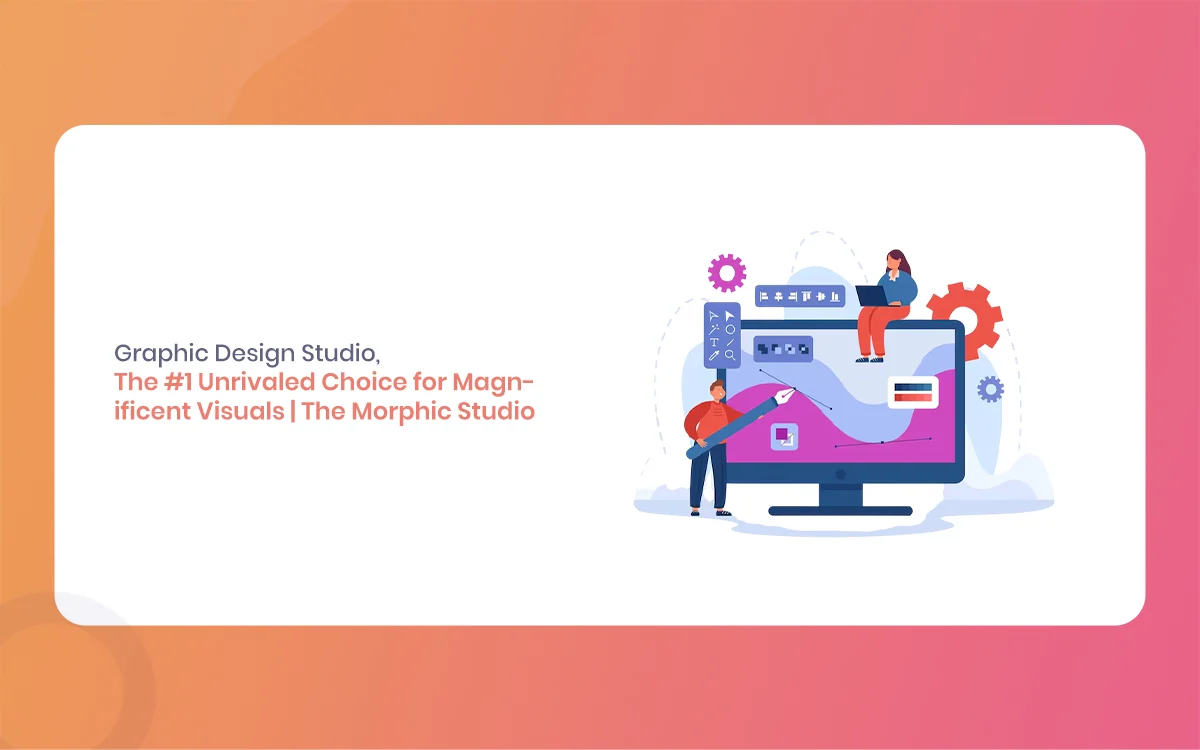
Graphic Design Studio: The #1 Unrivaled Choice for Magnificent Visuals | The Morphic Studio
Welcome to the visual revolution of 2026, everyone is scrolling at lightning speed, and your business has less than two seconds to make an impression. If your graphics look outdated, your audience will skip right past you, plain and simple. That is why choosing a top tier Graphic Design Studio is no longer just a […]
June 16, 2026
Graphic Design Company: 5 Unstoppable & Brilliant Design Strategies by The Morphic Studio
Welcome to The Morphic Studio. Graphic Design Company We know that building a brand in today’s fast-paced statistical world can feel completely overwhelming. Attention spans are shrinking rapidly, and the competition is only getting louder every single day. This is exactly why simply having a nice logo is no longer enough to survive. You need […]
June 15, 2026
Graphic Design Company in Ahmedabad: 7 Unstoppable & Brilliant Design Strategies by The Morphic Studio
Welcome to the statistical era of 2026 The Morphic Studio. Everyone is fighting for attention, scrolling through feeds at lightning speed, and ignoring anything that looks average. This is exactly where a professional Graphic Design Company in Ahmedabad steps in to save the day. At The Morphic Studio, we do not just make things look […]