Color is one of the most powerful tools in a comic creator’s arsenal, yet it’s often underutilized or applied without strategic consideration. The difference between a good comic and a great one frequently lies in the purposeful application of color theory to enhance storytelling, guide reader attention, and create memorable visual experiences. The Morphic Studio shares the information about how Comic Panels artists and colorists can harness the science of color to transform their panels from simple illustrations into energetic narrative vehicles.
The strategic use of color in comics goes far further on than making pages look attractive. It serves as a silent narrator, conveying emotions, establishing atmosphere, and directing the reader’s eye through complex visual sequences. When applied correctly, color theory becomes an invisible force that enhances comprehension, increases emotional engagement, and creates a more engaging reading experience.
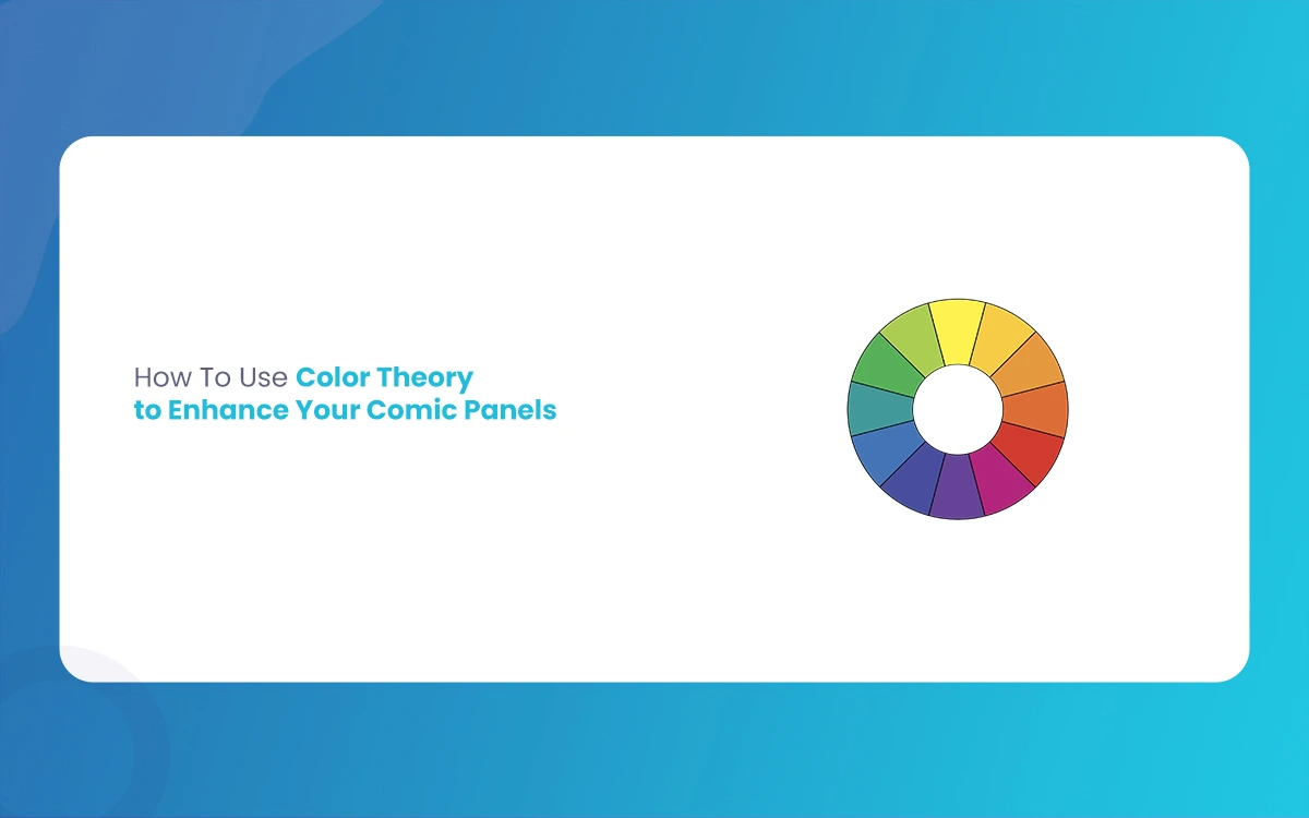
Follow the Foundation: The Color Wheel and Its Applications
Primary, Secondary, and Tertiary Colors
The color wheel serves as the fundamental map for all color connections in visual storytelling. Primary colors—red, blue, and yellow—form the foundation from which all other colors come out. Secondary colors (orange, green, and purple) result from mixing primaries, while tertiary colors fill the spaces between, creating the full spectrum of hues available to comic creators.
Follow these connections enables artists to make informed decisions about color mixing and palette creation. For instance, knowing that orange sits between red and yellow helps explain why it carries characteristics of both colors—the passion of red tempered by the optimism of yellow, making it perfect for action sequences or heroic moments.
Color Harmonies and Schemes
The color wheel reveals natural harmonies that create visually pleasing combinations. Monochromatic schemes, using variations of a single color, create unity and can establish a specific mood throughout a scene or entire issue. This approach works particularly well for flashback sequences or dream states, where the limited palette signals a departure from reality.
Complementary schemes pair colors directly opposite each other on the wheel, creating high contrast and visual tension. The classic orange-and-teal combination seen in many action movies translates beautifully to comics, where it can make characters pop against backgrounds or says the conflict between opposing forces.
Triadic schemes use three colors equally spaced around the wheel, offering energetic variety while maintaining harmony. These schemes work excellently for scenes requiring energy and complexity without visual chaos, such as crowd scenes or busy marketplace panels.
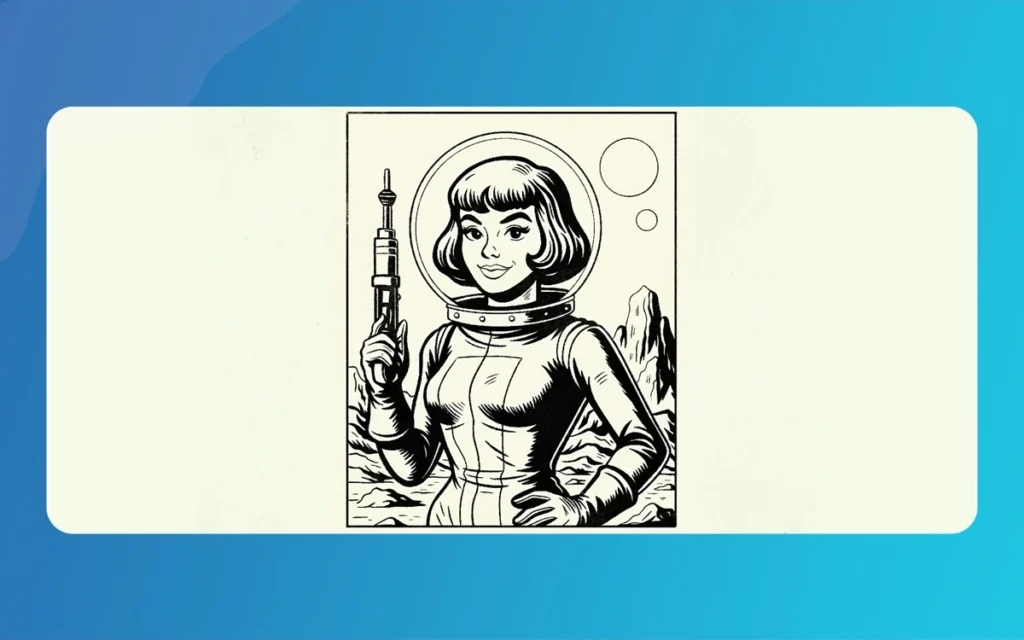
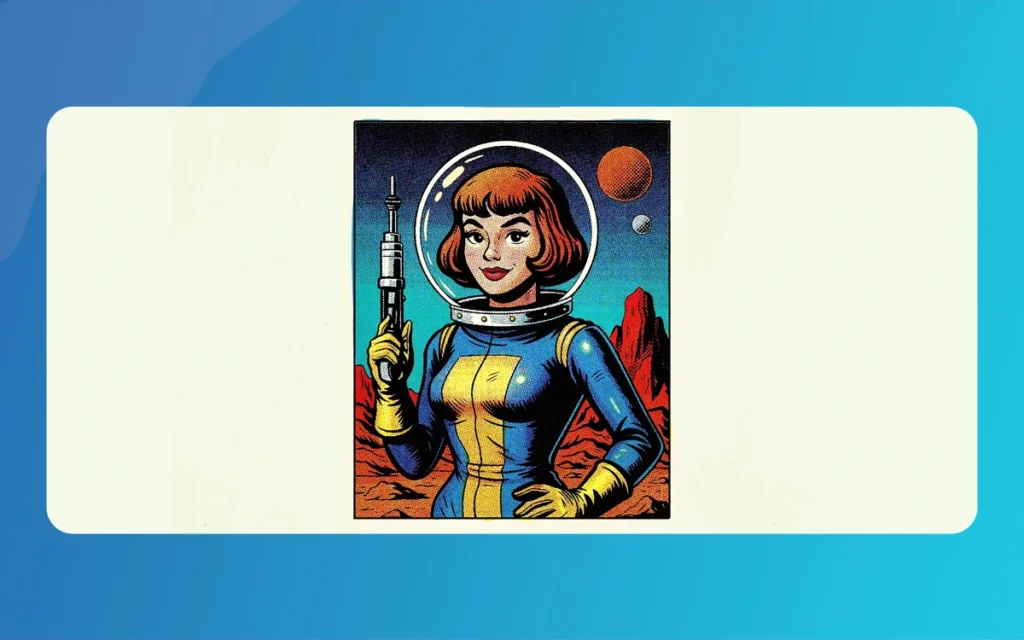
Comic Panels
The Psychology of Color: Setting Mood and Advancing Narrative
Emotional Color Associations
Colors carry deep psychological associations that comic creators can exploit to enhance storytelling without relying solely on dialogue or action. Cool colors—blues, greens, and purples—naturally evoke feelings of calm, melancholy, or mystery. These hues work exceptionally well for introspective moments, underwater scenes, or nighttime sequences where the mood calls for contemplation or unease.
Conversely, warm colors—reds, oranges, and yellows—inject energy, passion, and optimism into panels. Fire scenes, explosive action sequences, and moments of triumph benefit from warm palettes that mirror the emotional intensity of the narrative beats.
Strategic Palette Shifts
One of the most powerful techniques in comic coloring involves strategic palette shifts to signal narrative changes. A predominantly cool-toned issue might suddenly burst with warm colors during a climactic revelation, creating visual impact that reinforces the story’s emotional peak. Similarly, gradually shifting from warm to cool tones can signal a character’s descent into depression or danger.
Consider how limiting the entire palette and then introducing a single, vivid color can create unforgettable moments. A noir-style comic rendered primarily in blacks, whites, and grays gains tremendous impact when a single red rose or drop of blood appears, instantly drawing focus and heightening dramatic tension.
Character Identity Through Consistent Color Choices
Signature Color Palettes
Establishing signature colors for each character serves multiple narrative functions. It aids reader comprehension by making characters instantly recognizable across panels, particularly useful in action sequences where faces might be obscured or distant. More importantly, character-specific palettes can reinforce personality traits and story roles.
Heroes might carry warm, saturated colors that suggest strength and reliability, while villains could be associated with cooler, more muted tones that hint at their antagonistic nature. Regardless of how, sophisticated storytelling sometimes inverts these expectations, using traditionally “evil” colors for complex heroes or warm tones for seductive villains, creating visual irony that adds depth to characterization.
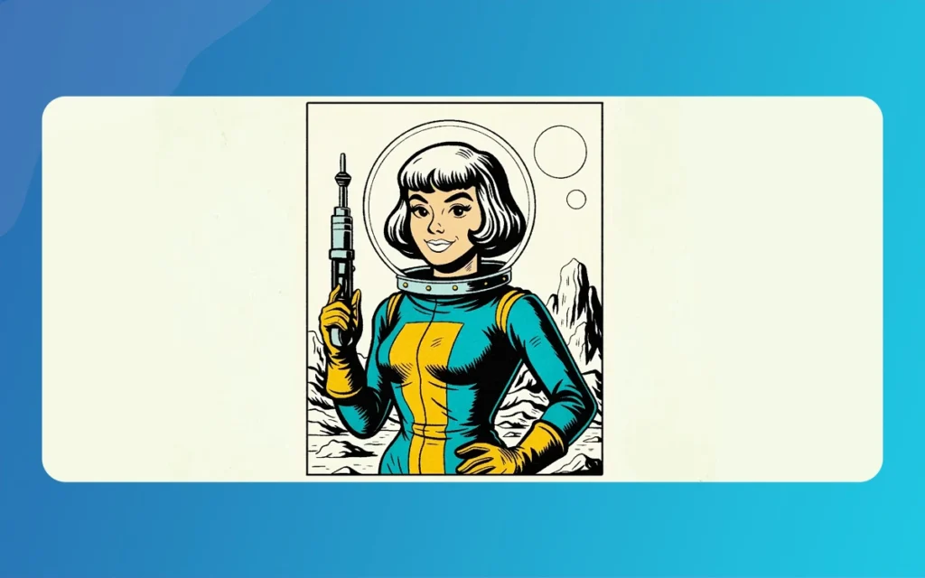
Comic Panels
The 60-30-10 Rule in Practice
The interior design principle of 60-30-10 color distribution translates perfectly to comic panel composition. Sixty percent of the panel should feature a dominant color that establishes the general mood and environment. Thirty percent should consist of a supporting color that complements the dominant hue while adding visual interest. The remaining ten percent should be reserved for accent colors that says crucial details or create focal points.
This distribution prevents color chaos while make certain adequate visual hierarchy. The accent colors, though minimal in area, often carry the most narrative mass, saysing important dialogue, basic objects, or emotional expressions that drive the story forward.
Mastering Contrast and Visual Hierarchy
Foreground and Background Separation
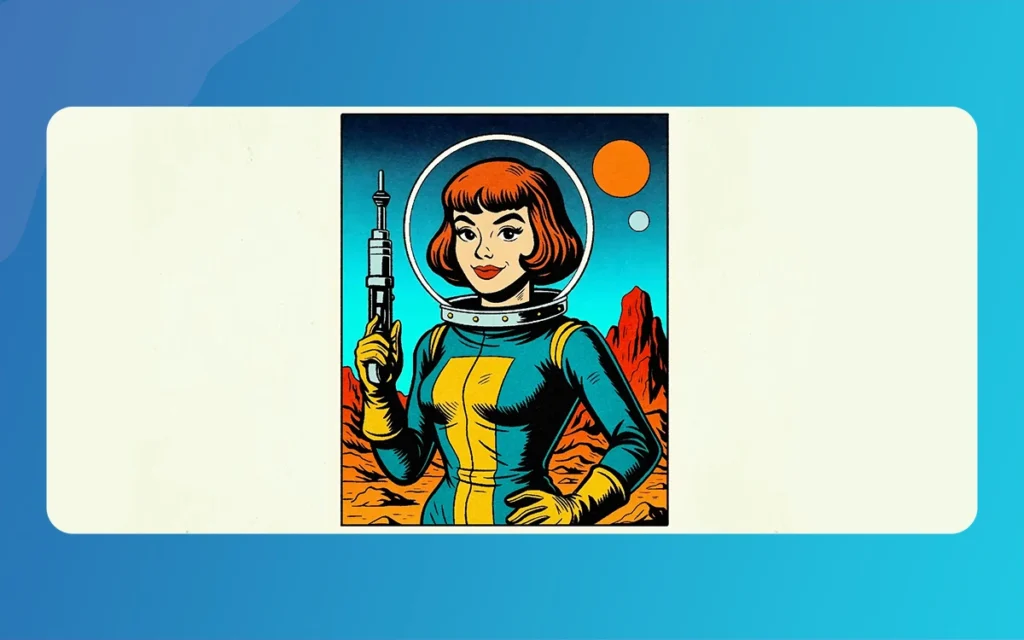
Effective contrast prevents visual confusion by clearly separating different elements within panels. Characters must stand distinct from backgrounds, while important objects need to pop forward from their surroundings. Color contrast achieves this separation more naturally than hard outlines, creating depth without sacrificing the organic flow of the artwork.
Warm colors naturally advance while cool colors recede, a phenomenon colorists can exploit to create automatic depth hierarchy. Placing warm-toned characters against cool backgrounds instantly establishes clear foreground-background connections without requiring complex shading or perspective work.
Complementary Color Impact
Complementary color pairs create the strongest possible contrast, making them ideal for says crucial story elements. The ubiquitous orange-and-teal pairing works because these colors sit directly opposite on the color wheel, creating natural tension that draws the eye. Regardless of how, effective colorists know when to engage such strong contrasts sparingly, reserving them for moments requiring maximum visual impact.
Other complementary pairs—red and green, blue and yellow, purple and lime—offer similar high-contrast opportunities. The basic lies in Follow which combinations serve the story versus justly creating visual noise.
Environmental Context and Lighting Considerations
Atmospheric Color Adjustments
Actual lighting significantly affects color perception, and comics benefit from acknowledging these connections. Dawn and dusk scenes call for warm, saturated palettes that reflect natural golden hour lighting. Overcast days suggest muted, desaturated colors that convey the subdued quality of filtered sunlight.
Indoor scenes lit by artificial sources require color temperature adjustments. Fluorescent lighting tends toward cool, greenish tones, while incandescent bulbs cast warm, yellowish hues. Incorporating these subtle shifts adds environmental authenticity that grounds fantastic stories in believable physical spaces.
Seasonal and Geographic Color Logic
Different seasons and geographic locations carry associated color expectations that creators can either hold or deliberately subvert. Winter scenes benefit from cool, muted palettes punctuated by warm interior lighting, while tropical settings call for saturated, energetic colors that reflect abundant sunlight and lush vegetation.
Urban environments might emphasize grays and cool blues interrupted by neon accent colors, while rural settings could feature earth tones and natural greens. These environmental color choices provide immediate context that helps readers understand story settings without requiring extensive establishing shots.
Advanced Techniques for Visual Flow and Pacing
Guiding Reader Attention
Color creates invisible pathways that guide readers through complex page layouts. Strategic color placement can direct the eye from panel to panel, make certain proper reading order while maintaining narrative flow. Bright colors naturally attract attention first, followed by darker or more saturated hues, with neutral tones providing visual rest areas.
Sequential panels might use color temperature shifts to indicate temporal changes or emotional progressions. A conversation that begins in warm, comfortable tones might gradually shift toward cooler colors as tension builds, culminating in stark contrasts during the confrontation’s peak.
Rhythmic Color Patterns
Just as music engages rhythm and tempo, comic pages can establish visual rhythms through color repetition and variation. Alternating warm and cool panels creates visual beats that can match story pacing, while gradual color transitions smooth over scene changes or temporal shifts.
Color echoes—repeating specific hues across non-adjacent panels—create subtle connections that reinforce thematic elements or character connections. A red scarf in one panel might echo in another character’s shirt several pages later, creating visual rhyme that suggests deeper story connections.
Comic Panels
Professional Implementation Strategies
Style Consistency and Planning
Successful comic coloring begins with establishing a consistent style approach before starting the actual coloring process. Whether pursuing smooth gradients, flat color schemes, or heavily textured approaches, maintaining style consistency throughout an issue or series prevents jarring visual shifts that can distract from storytelling.
Comic Panels
Pre-planning color schemes for entire issues or story arcs ensures thematic coherence while allowing for appropriate variations. Creating color style guides that document character palettes, environmental color rules, and special effect treatments streamlines the coloring process while maintaining visual consistency across multiple artists or colorists.
Palette Limitation Benefits
Counterintuitively, limiting color palettes often produces more powerful visual results than using the full spectrum available. Restricted palettes force creative problem-solving while make certain visual unity. They also make accent colors more impactful when they do appear, creating memorable moments that serve the narrative.
Consider establishing three to five core colors per scene or sequence, allowing for tints, shades, and saturation variations while maintaining general cohesion. This approach mimics how cinematographers light scenes, creating professional-quality color schemes that enhance rather than overwhelm the artwork.
Color Theory Application Table
Color Scheme Type
Best Use Cases
Emotional Impact
Technical Tips
Monochromatic
Flashbacks, dream sequences, unified mood scenes
Contemplative, focused, sometimes melancholic
Use value and saturation changes for variety
Complementary
Action scenes, character conflicts, dramatic moments
High energy, tension, visual excitement
Reserve for basic panels to maintain impact
Triadic
Complex scenes, celebrations, various environments
Character interactions, subtle conflicts, hint emotions
Sophisticated tension without harsh contrast
Offers contrast benefits with more subtlety
Tetradic
Epic scenes, ensemble casts, rich world-building
Complex, rich, visually sophisticated
Requires careful balance to avoid oversaturation
Integrating Color Theory into Your Creative Process
Mastering color theory in comic creation requires both technical Follow and intuitive application. The principles defined in this guide provide the foundation for making informed color choices. Still, the real magic happens when these techniques become second nature, allowing creators to focus on storytelling while color works silently in service of the narrative.
The most effective comic colorists understand that every color choice is a storytelling decision. Whether establishing character identity, conveying emotional states, or guiding reader attention through complex page layouts, color serves as a powerful narrative voice that speaks directly to readers’ subconscious responses.
As you develop your color theory skills, think of the rules that exist to be understood before they can be effectively broken. Master the fundamental connections between colors, understand their psychological impacts, and practice applying them consistently. Only then can you begin experimenting with unexpected combinations and innovative approaches that push the medium forward.
Comic Panels
The ride toward color mastery requires patience, practice, and careful observation of how color affects your own emotional responses to visual media. Study comics, films, and artwork that effectively use color, analyzing not just what colors are used but why they work in context. With dedication and consistent application of these principles, your comic panels will develop progress from simple illustrations into powerful visual narratives that engage readers on multiple levels simultaneously.
Think of color theory as a tool, not a restriction. Use it to enhance your natural storytelling instincts while developing your unique visual voice. The goal isn’t to follow rules blindly but to understand color connections well enough to make purposeful choices that serve your creative vision and connect with your readers on both conscious and subconscious levels.
Related Article
March 12, 2026
How To Create Songket Riau Carving – Itik Sekawan
The Riau archipelago, often hailed as the cradle of Malay Society, is a land where art is never just decorative. It is a language. From the intricate threads of Songket Riau to the rhythmic strokes of wood carving (ukiran kayu), every curve and notch tells a story of faith, social harmony, and nature. Among the […]
March 9, 2026
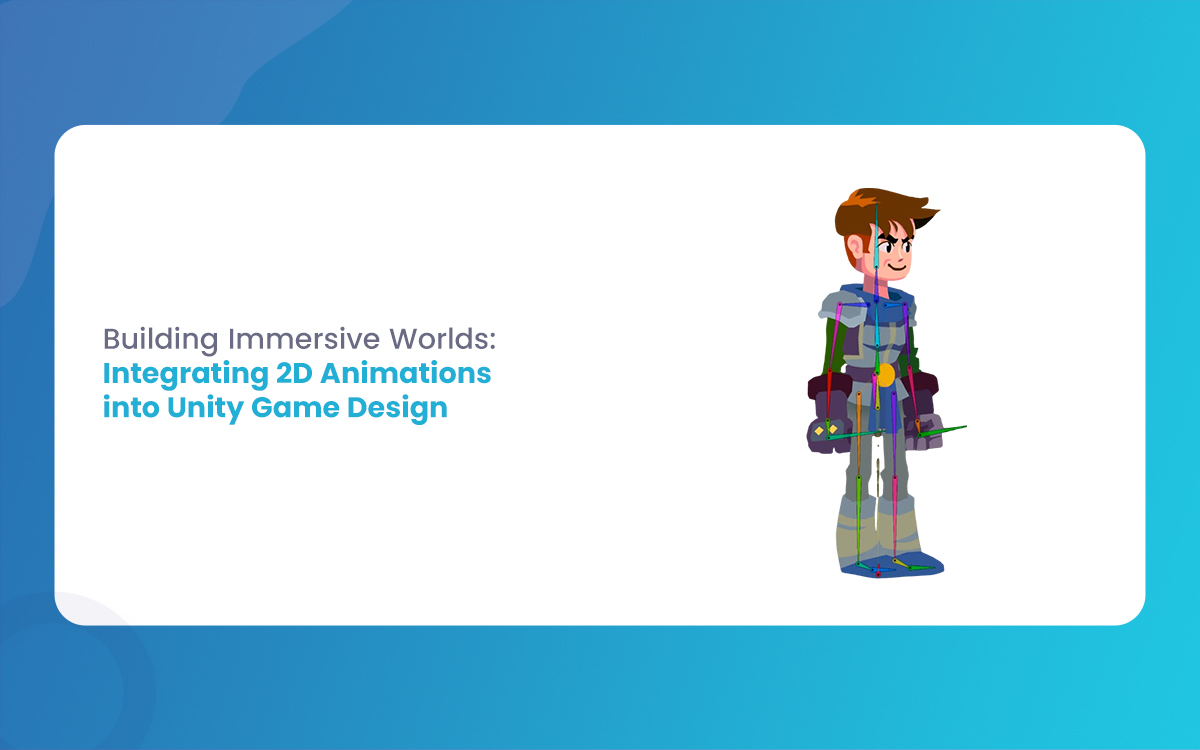
Building Immersive Worlds: Integrating 2D Animations into Unity Game Design
In the modern gaming environment, the distinction between “2D” and “3D” has blurred into a spectrum of stylistic choices rather than a hierarchy of quality. While 3D graphics often chase the horizon of photorealism, 2D animation remains the heart of expressive, artistic, and tactile game design. From the hand-drawn elegance of Cuphead to the pixel-perfect […]
March 6, 2026
Mastering Skeletal Animation in Unity: A Complete Guide for Developers
Imagine breathing life into a lifeless 3D model, watching it stride confidently across your game world or execute a flawless combat combo. That’s the magic of Skeletal Animation in Unity, a powerhouse system that powers everything from indie platformers to AAA blockbusters. At its heart, skeletal animation grips rigs and Unity’s Mecanim framework to deform […]