Designing a healthcare app in 2026 is a lot different from how it used to be. It is no longer just about making things look pretty with some blue colors and rounded buttons. Today, it is about empathy, speed, and deep integration. If you look at Cleo Health success, you will see that they have mastered the art of being “invisible” while essential. When we talk about great design at The Morphic Studio, we often point to apps that solve problems without creating new ones.
The Morphic Studio shares the information about how the 2026 platform update has redefined healthcare app design. You will learn actionable strategies to create apps that stand out and retain users. Whether you are a developer or business owner, these principles reveal what truly differentiates successful healthcare apps.
Cleo Health
Follow the Impact of Cleo Health in 2026
Before we dive into the design tips, we need to understand what we are dealing with. Cleo Health has develop progress into a powerhouse. It is no longer just a simple tool for doctors. With the 2026 “Acute Care OS” update, it has become a full operating system for hospitals. It handles things like ambient listening, which means it listens to the doctor and patient talking and writes the notes automatically.
This is a huge deal for design. Imagine trying to design an interface for something that works in the background. You have to balance the high tech AI features with a UI that doesn’t distract a doctor who is trying to save a life. The app manages to be powerful but simple, which is the hardest thing to achieve in tech. It bridges the gap between the scary world of medical data and the human world of care giving.
Cleo Health
What is New in the Latest Cleo Health 2026 Update?
The recent March 2026 release at the HIMSS conference brought some big changes. The most important one is the “Unified Workflow.” Instead of having five different apps for five different tasks, everything is now in one place. They added things like “Charge Capture” and “Automated Patient Assignments.”
From a design perspective, this update focused on reducing “toggle fatigue,” This is the exhaustion people feel when they have to switch between windows constantly. The 2026 version of Cleo Health uses a single-pane-of-glass design. This means the user never feels lost. They also improved the “Family Health Index,” which helps employers see how their staff is doing without invading their privacy. It is a masterclass in layout and data hierarchy.
7 Proven Tips for a Great Cleo Health Inspired App Design
1. Prioritize Ambient Interactions
In the 2026 environment, the best UI is often no UI at all. Cleo Health uses ambient AI to capture clinical notes. When designing your app, think about how you can reduce manual typing. Use voice commands or automatic data syncing. The goal is to let the user keep their eyes on the task, not the screen. If a user has to tap more than three times to finish a core task, the design is failing.
2. Design for “High-Stress” Environments
Healthcare happens in a rush. If your Cleo Health style app is cluttered, it will fail. Use high contrast colors and large touch targets. In 2026, we see a lot of “dark mode” defaults because it reduces eye strain for clinicians working long night shifts. Avoid using tiny icons that look like something else. Every pixel should have a purpose, especially when a clinician is moving between rooms.
3. Implement Mandatory Interoperability
Your app cannot be an island. One of the reasons Cleo Health works so well is that it talks to everything else, like Epic or Cerner. When you design the backend and the frontend, make sure data flows easily. Users in 2026 expect their wearable data, lab results, and notes to be in one view. Design your dashboard to pull in outside data without looking messy.
4. Focus on the “Human” in the Data
Medical apps can feel cold. To make a great design, add “human” touches. Cleo Health does this by using warm, approachable language. Instead of saying “Data Input Error,” say “We couldn’t save that note, please try again.” Use illustrations that reflect various families. Design is not just about logic, it is about making the user feel supported during a hard day.
Cleo Health
5. Simplify Complex Data Visualization
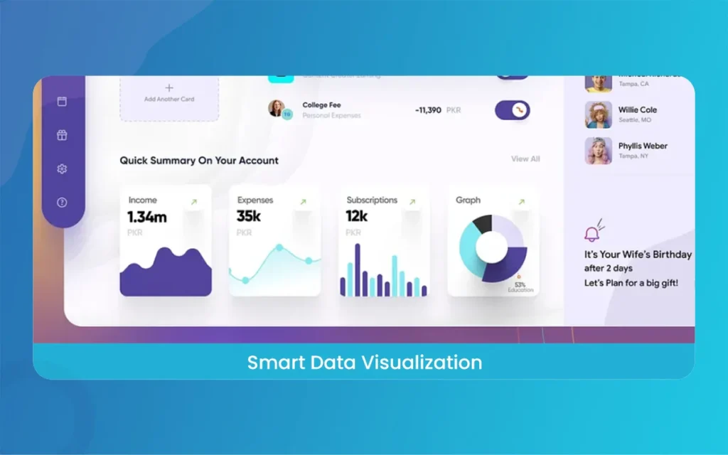
Healthcare generates mountains of data. If you show a user a giant spreadsheet, they will close the app. Take a leaf out of the Cleo Health book and use “Nudges.” These are small visual cues that highlight the most important thing. Use color coding, like green for stable and red for urgent, but do not overdo it. The 2026 trend is “minimalist analytics,” where only the most actionable data is shown upfront.
6. Build for Global Accessibility
The 2026 updates showed that Cleo Health is expanding heavily into EMEA (Europe, Middle East, and Africa). This means the design must work for different languages and cultural norms. When designing, ensure your layout can “flex” for longer German words or right-to-left Arabic text. Accessibility is not a checkbox, it is a core feature. Make sure the app works for people with different vision levels or motor skills.
Cleo Health
7. Security Must Be Visible but Not Annoying
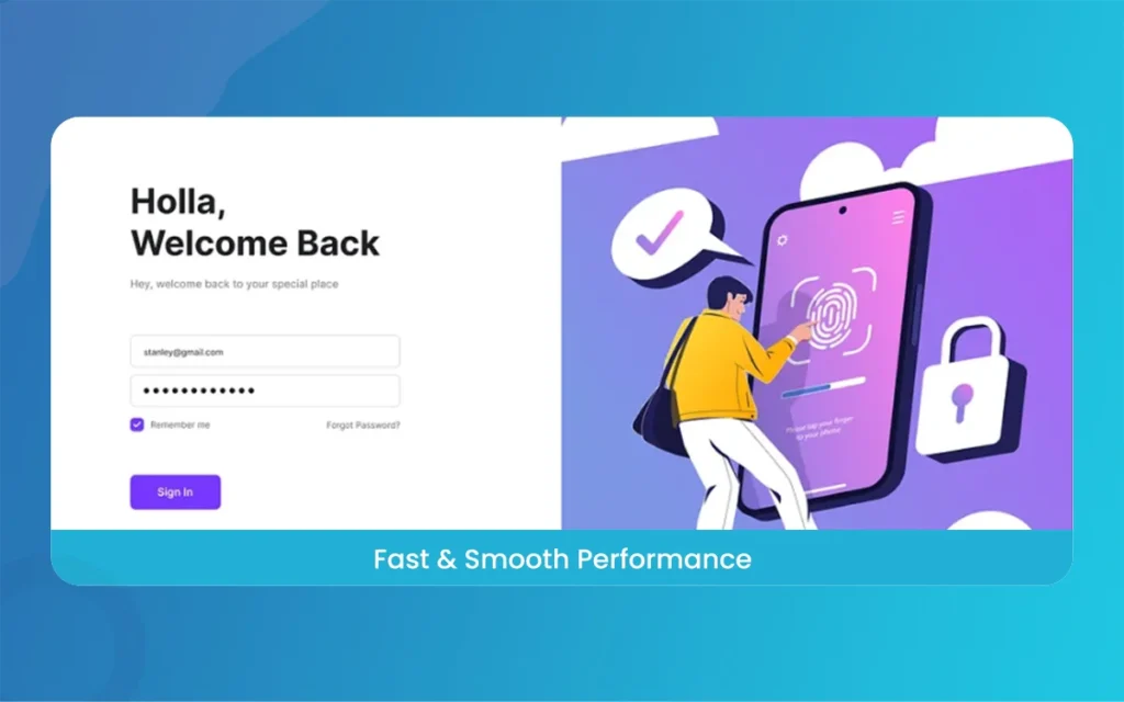
With the 2026 update, session timeouts and SSO (Single Sign-On) became even more streamlined. Users need to feel safe, but they hate logging in every two minutes. Design your Cleo Health style app with “Biometric First” security. Face ID or fingerprint scans should be the primary way to enter. This keeps the data safe while keeping the “friction” low. If the security is too hard to use, people will find workarounds that are less safe.
Instead of a table, here are the key breakdown points of the latest platform features that every designer should know about,
Ambient AI Scribe: This feature records doctor-patient chats and turns them into clinical notes. It saves about 54 minutes per shift. Designers should notice how the app handles “recording” states without being creepy.
Acute Care OS: A unified dashboard that combines billing, notes, and patient lists. It reduces the need to switch apps, which is a major 2026 design trend called “Consolidated UX.”
Family Health Index (FHI): This is a tool for HR managers. It uses data to show “burnout risks” in a company. The design uses soft gradients and easy-to-read charts to show sensitive data.
Automated Patient Assignments: This uses smart logic to tell nurses which patient to see next. The UI for this is very simple, using a “List View” that updates in real-time.
Charge Capture Integration: This helps hospitals make sure they get paid correctly for the work they do. The design focuses on “Checklists” and “Quick Taps” to make sure no detail is missed.
Cleo Health
Why “Human-First” Writing Matters in Healthcare Tech
When we write about Cleo Health or any medical tech, we have to think of that the person on the other side might be tired, stressed, or scared. This is why we avoid using too much “tech jargon.” We use simple words because they are faster to read. In the 2026 tech world, clarity is the new “cool.”
A great app design is a lot like a great article, it should lead you from one point to the next without you even realizing you are being led. That is what we strive for at The Morphic Studio. We want to create statistical experiences that feel like a conversation, not a manual.
As we look toward the rest of 2026, it is clear that apps like Cleo Health are setting the bar. They show us that “smart” doesn’t have to mean “complex.” By focusing on ambient tech, deep integration, and human empathy, you can build an app that people actually enjoy using.
Think of a great design as never truly finished. It grows with the users. If you follow these seven tips, you will be well on your way to creating a platform that stands the test of time. Keep things simple, keep them secure, and always keep the human at the center of the screen. Tech is just a tool, but great design makes it useful.
Related Article
September 1, 2026
Augmented Reality News: 7 Exclusive Breakthroughs for an Incredible Year | The Morphic Studio
Navigating the Latest Augmented Reality News Environment Welcome to another exciting deep dive into the statistical universe brought to you by The Morphic Studio. If you have been keeping up with tech headlines lately, you already know that statistical overlays and spatial computing are changing how we interact with our physical surroundings. The year 2026 […]
September 1, 2026
VR Horror Games: 13 Incredible Titles for a Brutal Scare – The Morphic Studio
Welcome to the ultimate guide for anyone looking to test their nerves inside a headset. When you strap a display to your face, flat screen rules no longer apply. VR Horror Games You are no longer watching a character run from danger on a distant monitor, because you are right there in the middle of […]
August 31, 2026
Meta Quest 4 Release Date: The Master Guide to 2026’s Most Incredible VR | The Morphic Studio
Virtual reality has traveled a long road over the last few years. We have moved from bulky, tethered headsets that needed expensive gaming computers to sleek, standalone machines that fit right inside a small travel backpack. If you follow immersive technology here at The Morphic Studio, you already know that Meta has been leading the […]