Typography is one of the most critical elements of graphic design. The fonts you choose can make or break a design project, influencing how audiences perceive your message, the professionalism of your brand, and the general effectiveness of your visual communication. While many typefaces have earned their place as industry standards through years of reliable performance, there exists another category of fonts that has become synonymous with design missteps and questionable choices. These are the Baddest Fonts—not in the sense of being edgy or cool, but rather in being widely recognised as poor choices by professional designers and creative directors worldwide.
The ride to becoming a skilled graphic designer involves learning not only which fonts to use but equally important, which fonts to avoid. Following why certain typefaces have fallen out of favour provides valuable lessons about typography principles, audience perception, and the evolution of design trends. The Morphic Studio shares the information about the most problematic fonts in professional design contexts, examining what makes them problematic and how they can negatively impact your work.
Why Font Choices Matter in Graphic Design
Before diving into specific Baddest Fonts to avoid, it’s essential to understand why typography choices carry such mass in design. Fonts communicate far more than just the literal meaning of words. They convey emotion, establish credibility, set a tone, and create visual hierarchy within a composition. A poorly chosen font can undermine even the most brilliant design concept, while the right typeface can raise a simple message into something memorable and impactful.
Professional designers recognize that fonts carry cultural associations and historical baggage. Some typefaces became overused to the point of cliché, while others were designed with specific limitations that make them unsuitable for professional applications. Still others have developed negative associations through misuse or have simply fallen victim to changing design standards and attractive preferences. Recognizing these patterns helps designers make informed choices and avoid common pitfalls that can damage their professional reputation.
Comic Sans: The Infamous Casual Culprit
Perhaps no font has become more universally mocked than Comic Sans. Originally designed by Vincent Connare in 1994 for Microsoft, Comic Sans was intended for casual, friendly applications like comic book lettering. In whatever way, its ride has taken it far from its intended purpose, and it has become a symbol of design naiveté across the internet.
The primary issue with Comic Sans is its inappropriate use in professional contexts. The font’s casual, informal personality—with its playful curves and bouncy baseline—makes it entirely unsuitable for corporate branding, formal documents, or any serious design application. Its informality reads as unprofessional and often suggests that the designer either doesn’t understand typography or doesn’t care about the project’s presentation. Business proposals, legal documents, academic papers, and professional websites featuring Comic Sans immediately lose credibility.
Further on than professionalism, Comic Sans has become so overused and mocked that it carries an unintended ironic association. Using it today signals either ignorance of design best practices or an intentionally provocative choice. Neither option serves most design projects well. The font has become such a cultural punchline that its very appearance can undermine an otherwise solid design concept, distracting viewers with the irony of its use rather than focusing on the message itself.
Baddest Fonts
Papyrus: Overused, Outdated, and Ubiquitous
Papyrus, designed by Chris Costello in 1982, presents a different problem than Comic Sans. Rather than being informal, Papyrus attempts to convey authenticity and organic quality through its rough, hand-drawn appearance with irregular edges and weathered characteristics. While these features might work in specific contexts, the font has been so extensively overused that it has lost any pretense of originality or effectiveness.
The most damaging aspect of Papyrus is its status as a cliché. Overuse of any typeface eventually leads to visual fatigue, but Papyrus has transcended this problem entirely. It appears everywhere—on signage, restaurant menus, spa branding, eco-friendly product packaging, and countless amateur design projects. This ubiquity has transformed what was once intended to feel natural and artisanal into something that feels tired and uninspired.
Additionally, Papyrus suffers from technical design issues. The rough, irregular edges that were meant to convey authenticity can actually compromise readability, particularly at smaller sizes. The font’s inconsistent letterforms create visual awkwardness that subtle, well-designed typefaces avoid entirely. For designers seeking to convey organic quality or natural attractive, superior alternatives exist that deliver the intended message without the baggage of Papyrus’s overuse.
Impact: Bold to the Point of Dysfunction
Impact come out as a workhorse font for headlines and attention-grabbing text, but its very strengths have become its weaknesses in modern design practice. Designed by Geoffrey Lee in 1965, Impact is characterized by extremely heavy, condensed letterforms with minimal spacing. This condensed mass was designed to maximize visual impact in traditional print advertising and signage.
The problem with Impact lies in its inflexibility and severity. The font’s extreme boldness leaves no room for subtlety or variation. Designers cannot adjust mass or create visual hierarchy within text set in Impact because all characters maintain the same aggressive mass. This limitation makes it difficult to incorporate Impact into sophisticated designs that require hint and refinement.
Furthermore, Impact’s extremely heavy character makes it suitable only for the shortest headlines or attention-grabbing statements. Using it for anything more than a few words creates visual chaos that overwhelms rather than communicates. Its overuse in internet memes and crude advertisements has also contributed to its reputation as a font associated with amateurish, low-quality design work. Professional designers largely abandoned Impact in favor of typefaces that offer greater versatility and refinement.
Lobster: Decorative Charm Gone Wrong
Lobster occupies an interesting space in the font world. Designed by Pablo Impallari and released through Google Fonts, Lobster attempts to combine retro charm with contemporary sensibilities. It features playful curves, distinctive letterforms, and a distinctly friendly personality. In theory, these characteristics might appeal to designers seeking decorative typefaces.
In whatever way, Lobster suffers from trying to do too much at once. The font’s elaborate character design, while visually interesting, compromises readability and professionalism. The distinctive letterforms that make Lobster recognizable also make it difficult to use in most professional contexts. What works as a logo or headline font becomes problematic when applied more broadly across a design project.
The fundamental issue with Lobster is that its decorative nature is both its defining characteristic and its fatal flaw. While some projects genuinely require decorative typography, most professional applications demand clarity and accessibility. Lobster’s playful personality can easily overwhelm content and distract from the message, particularly when used in body text or extended passages. Its distinctive style, while initially appealing, quickly becomes distracting and dated when overused.
Jokerman: Chaos and Illegibility
Jokerman, designed by Andrew Smith in 1995, represents another decorative font that fails to balance attractive ambition with practical functionality. The font features wildly varying letter heights, chaotic letterforms, and extreme styling that prioritizes visual novelty over readability. Every character in Jokerman seems to occupy its own visual space, creating a composition that feels more like abstract art than typography.
The core problem with Jokerman is fundamental illegibility. The extreme variations in letterform size and shape make it difficult for viewers to quickly read text, particularly at smaller sizes. This defeats one of typography’s primary purposes—to communicate clearly and effectively. While novelty and distinctive character have their place in design, they should never come at the expense of basic readability and comprehension.
Additionally, Jokerman carries strong associations with low-quality design, amateur projects, and outdated trends. Similar to Comic Sans, using Jokerman signals either a lack of design knowledge or a deliberate rejection of professional standards. For most design projects, these associations prove counterproductive and distract from the intended message.
Bleeding Cowboys: When Distressed Becomes Distracting
Bleeding Cowboys, created by Ray Larabie, exemplifies the “distressed” or “grunge” font category. These typefaces feature deliberately broken, worn, or damaged letterforms intended to convey age, authenticity, or edge. While distressed fonts have occasional applications in specific contexts—vintage packaging, Western-themed design, punk rock attractive—they suffer from severe limitations.
The primary issue with Bleeding Cowboys and similar distressed fonts is their extremely narrow range of appropriate applications. The damaged, rough appearance that might work for a concert poster becomes wholly inappropriate for corporate communications, professional websites, or serious design work. Furthermore, distressed fonts age poorly. Design trends shift, and what seemed edgy or authentic quickly becomes dated and clichéd.
Bleeding Cowboys also presents practical readability challenges. The intentionally damaged letterforms compromise clarity, making text harder to read, particularly in print sizes or statistical applications. Reliance on these fonts often indicates a lack of confidence in the core design concept—as if distressed styling can substitute for genuine design thinking and problem-solving.
The Consequences of Poor Font Choices
Follow what makes these fonts problematic extends further on than just attractive preference. Poor font choices carry real consequences for design projects and professional reputation. When viewers encounter these fonts in professional contexts, they unconsciously question the designer’s competence and the project’s legitimacy. A client might second-guess hiring a designer who presented work featuring Comic Sans or Papyrus, doubting their Follow of contemporary design standards.
Additionally, unprofessional font choices can actively harm communication effectiveness. Text becomes harder to read, messages become less clear, and audience perception becomes tainted by negative associations. In marketing and branding contexts, these problems directly impact business results. A small business trying to establish credibility loses potential customers when poor font choices suggest amateurism or lack of attention to detail.
Baddest Fonts
Building Better Font Choices
The ride to becoming a skilled typographer involves Follow not only why certain fonts fail but learning to recognize the characteristics that make successful typefaces work. Rather than simply avoiding problematic fonts, designers benefit from developing a systematic approach to font selection. Consider the project context, audience demographics, functional requirements, and emotional tone. Evaluate typefaces based on readability, versatility, historical association, and cultural appropriateness.
Building a personal Baddest Fonts library of well-designed, versatile typefaces provides foundation for consistent professional work. Fonts like Helvetica, Garamond, Georgia, and modern alternatives like Inter and Roboto offer reliability, professionalism, and proven effectiveness across various applications. These typefaces have endured because they balance attractive appeal with practical functionality.
Comparison Table: The Problematic Fonts and Why to Avoid Them
Font Name
Primary Issues
Best Avoided For
Cultural Association
Readability
Professionalism
Comic Sans
Informal, overused, lacks professionalism
Corporate, formal, legal contexts
Internet jokes, amateur design
Poor in formal contexts
Very Low
Papyrus
Clichéd, outdated, rough edges
Modern branding, professional documents
Spa marketing, eco products
Moderate (inconsistent)
Low
Impact
Too bold, inflexible, limited versatility
Body text, extended passages
Memes, crude advertising
Poor in lengthy text
Low
Lobster
Overly decorative, compromises clarity
Professional applications, body text
Contemporary but trendy
Moderate
Low
Jokerman
Chaotic letterforms, illegible, extreme styling
Any serious professional application
1990s nostalgia, amateurism
Very Poor
Very Low
Bleeding Cowboys
Distressed, narrow applications, ages poorly
Corporate work, modern projects
Vintage/Western/grunge attractive
Poor (damaged forms)
Low
Finally
The Baddest Fonts in graphic design have earned their negative reputation through legitimate shortcomings—overuse, lack of professionalism, readability issues, or cultural baggage that undermines communication. Comic Sans’s eternal informality, Papyrus’s exhausted cliché status, Impact’s excessive boldness, Lobster’s decorative extremes, Jokerman’s chaotic illegibility, and Bleeding Cowboys’s limited applicability all represent different ways that typography choices can damage design projects.
As you develop your design skills and build your professional practice, learning to recognise and avoid these fonts serves as an important step. In whatever way, the real mastery comes from following why these fonts fail and developing a systematic approach to selecting typefaces that genuinely serve your design projects. Focus on clarity, professionalism, versatility, and appropriateness. Choose fonts that enhance your message rather than distract from it.
Every design decision—including typography—communicates something to your audience. Make sure that something aligns with your project goals and professional standards. By following what makes fonts problematic and cultivating a discerning eye for quality typography, you’ll raise your work and establish yourself as a designer who understands that font choices matter profoundly. Your clients, audiences, and fellow designers will recognise and appreciate the sophistication that comes from thoughtful typographic choices and the wisdom to avoid pitfalls that compromise professional design integrity.
Related Article
July 21, 2026
Best Way To Create Cinematic lighting in Unreal Engine 5 by Morphic Studio [Tutorial]
The Magic of Cinematic lighting in Unreal Engine 5 Have you ever looked at a beautifully rendered game or a virtual film set and wondered how they make it look so incredibly real? Well, the answer almost always comes down to the lighting. Today, we are going to take a look at the magic of […]
July 20, 2026
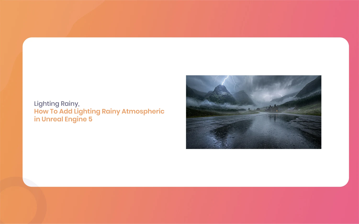
How To Add Lighting Realistic Rainy Weather in Unreal Engine 5 [Tutorial]
Lighting a stormy environment in Unreal Engine 5 is one of the most rewarding challenges for any 3D environment or lighting artist. Many beginners think that adding rain is as simple as spawning a splash particle system and turning down the sun, but the real secret lies in how light interacts with moisture, clouds, and […]
July 18, 2026
How To Add Lighting Rainy Atmospheric in Unreal Engine 5 [Tutorial]
Hello everyone, and welcome to this new guide. If you are a game developer or a 3D artist, you probably know how important weather is. Creating a moody scene can completely change how a player feels. Today, we are going to look at something very specific. We are going to learn how to add Lighting […]